


Introduction
This article shifts focus to another critical aspect of data representation: building visual dashboards. These dashboards translate complex cube data structures into easily interpretable, two-dimensional visual formats, enhancing the data analysis and decision-making processes.
Exploring Common Graph Types for Dashboards
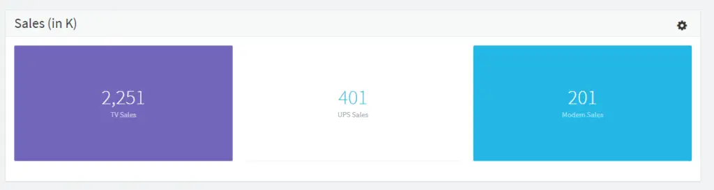
- Scorecards: Ideal for highlighting key metrics such as KPIs and ratios. Scorecards provide a clear, concise view of critical data points, facilitating quick insights.
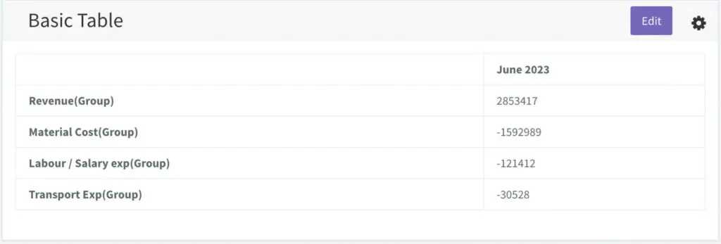
- Basic Tables: Not just for displaying rows and columns of data, these tables also allow for direct editing and updating, offering a functional interface for data interaction.
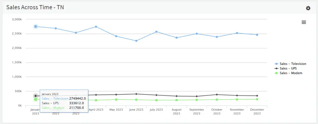
- Line Charts: Excellent for visualizing trends over time. Line charts can display multiple data series, with options to toggle specific lines on or off for focused analysis.
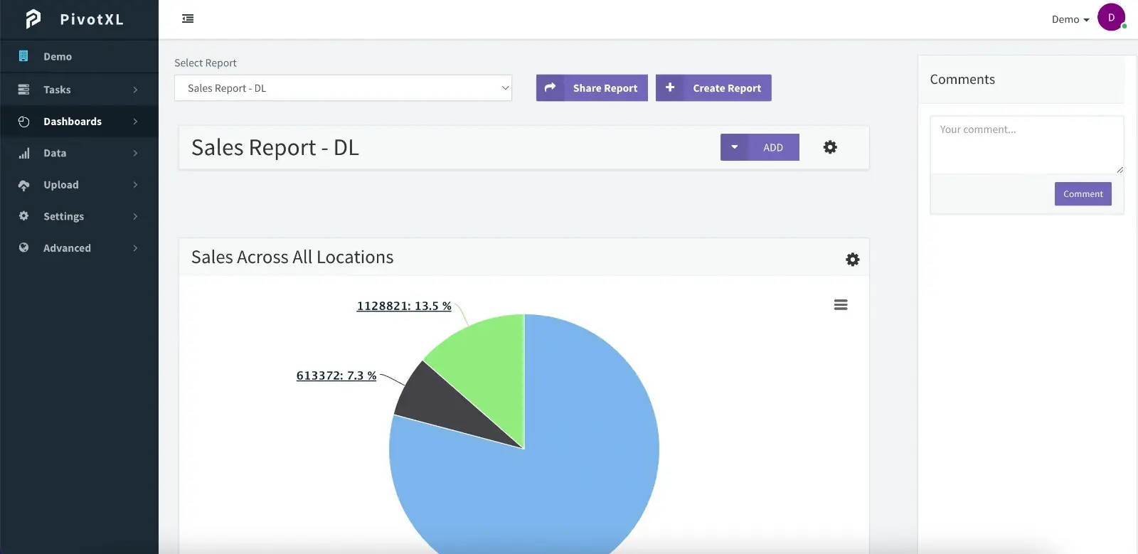
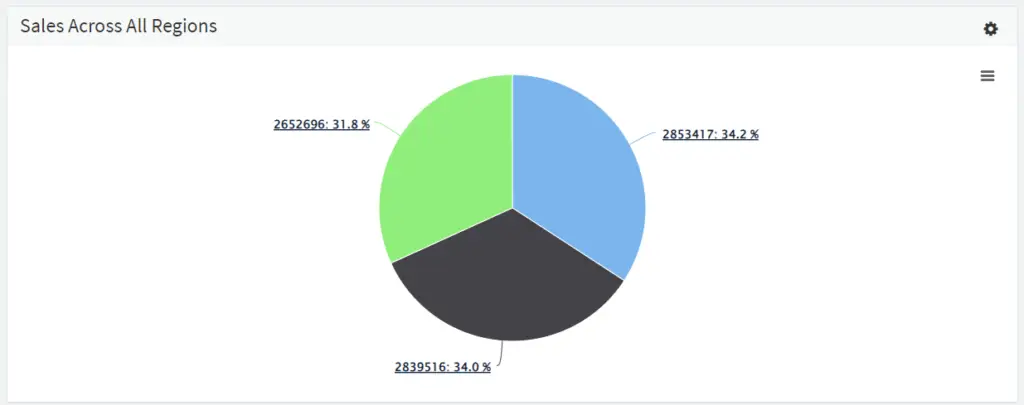
- Pie Charts with Drill-Down Capabilities: Each segment of the pie chart can correspond to a specific data cell or group. The drill-down feature enables users to delve deeper into grouped data for more detailed insights.
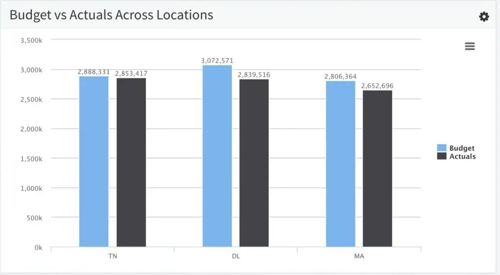
- Column Charts: These are particularly useful for comparative analysis, such as budget versus actuals. Users can toggle different data sets on or off for a customized view.
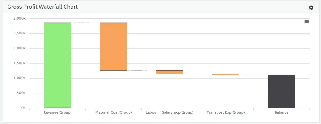
- Waterfall Charts: A powerful tool for understanding the sequential breakdown of data, such as the steps leading to a final profitability figure. Waterfall charts provide a visual narrative of how individual elements contribute to the overall picture.
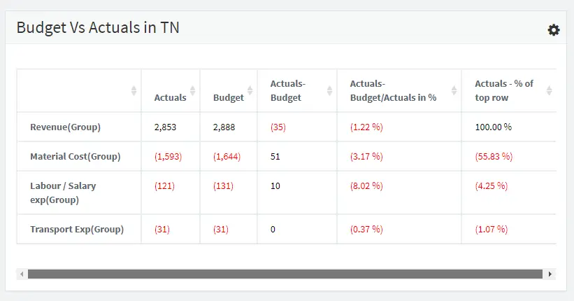
- Differential Tables (Diff Tables): These tables are highly effective for comparing sets of data, like budget versus actuals. They not only present the raw figures but also offer a percentage breakdown, adding a layer of analysis to the comparison.
Leveraging Visual Dashboards for Enhanced Insights
Visual dashboards built on cube data structures provide a multifaceted view of an organization’s data. They enable finance professionals and decision-makers to interpret complex data sets easily, identify trends, and make informed decisions based on real-time data analysis.
Future articles will delve into the technical aspects of creating these dashboards, exploring how to best utilize tools and techniques to extract maximum value from your data.