


Filters are essential tools for streamlining reports and making informed financial decisions. By applying custom filters, you can focus on specific data sets tailored to your needs. This approach helps you organize and analyze data efficiently, providing deeper insights. With PivotXL, you can leverage all available dimensions to create powerful filters that dynamically update reports based on your selected members.
Using Filters in the PivotXL Dashboard
Filters in PivotXL make it easy to find and focus on specific data, simplifying your data analysis process. Here’s how filters can help you manage reports more effectively:
- Effortless Data Search: Quickly locate the information you need by applying filters to table reports.
- Dynamic Data Control: Instantly update reports by switching dimension members to view different perspectives.
- Enhanced Data Insights: Analyze key data segments without the clutter of irrelevant information.
- Flexible Filtering: Create and use multiple filters to customize your dashboard reports.
With these features, PivotXL’s filtering options empower you to gain deeper insights and make smarter decisions with your data.
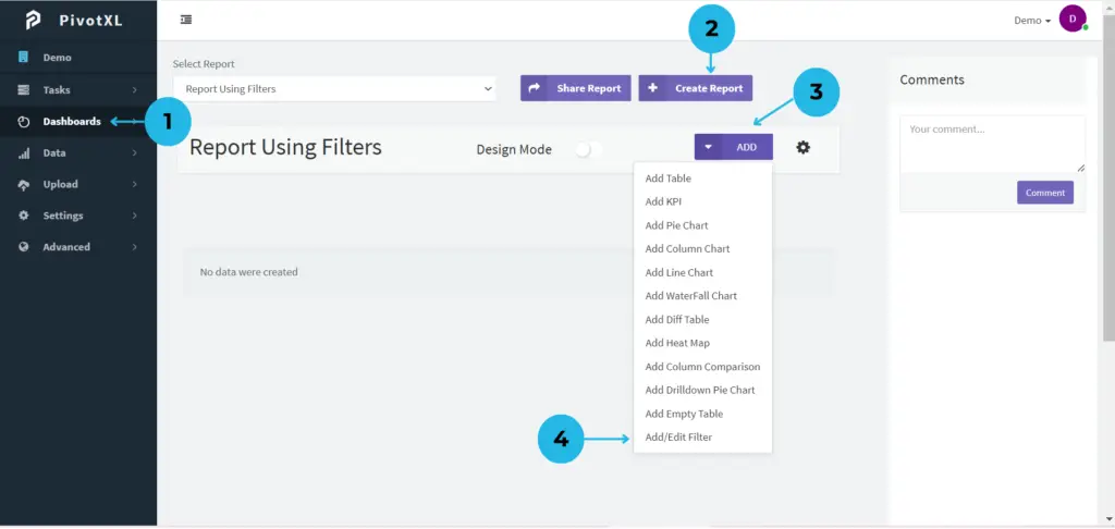
1.Navigate to the Dashboards menu from the left-side navigation panel in the PivotXL application.
2.Click the Create Report button to set up a custom report tailored to your data needs.
3.After creating a report, it will appear in the dashboard list. Select the report and click the ADD button to access various management options.
4.From the available options, choose Add/Edit Filter to create new filters or modify existing ones. Filters enable focused data analysis by narrowing down your report views based on selected criteria.
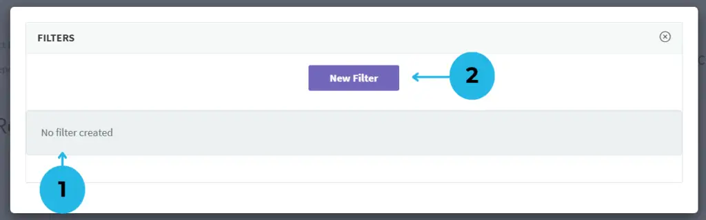
1.Click Add/Edit Filter, which opens a new pop-up. If no filters are present, you’ll see a No Filter message.
2.Click the New Filter button to begin setting up a filter for your report. A new tab will appear, providing comprehensive filter setup options.
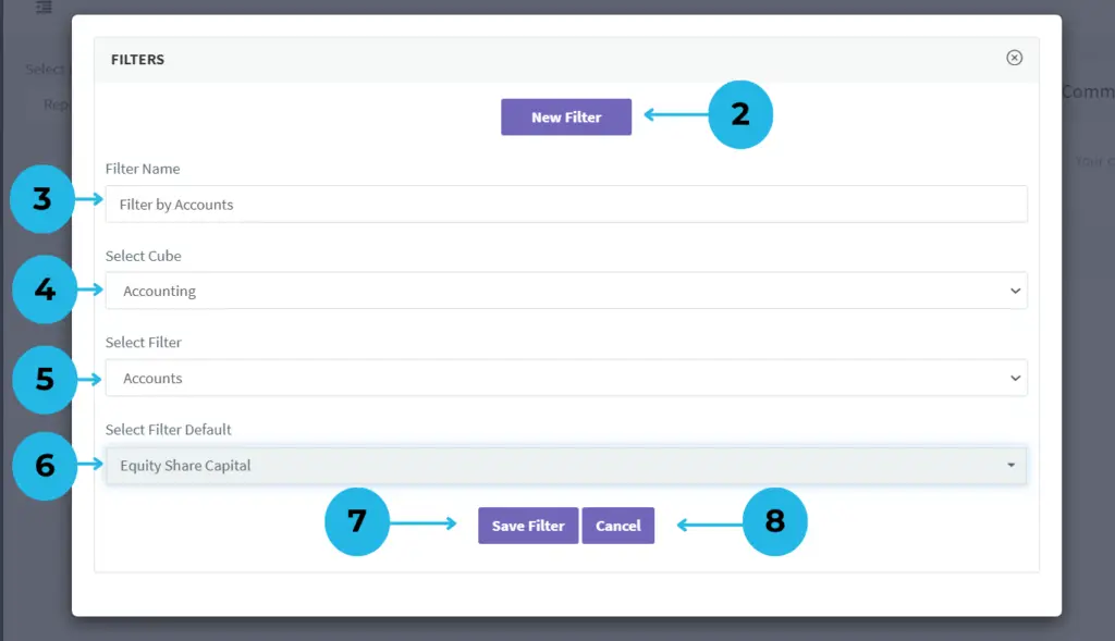
2.Click the New Filter button to start setting up a filter for your report.
3.Enter a descriptive name for your filter.
4.Choose the cube relevant to the report.
5.Select the dimension for filtering (e.g., Accounts, Locations).
6.Set the starting member for the filter, such as a default account.
7.Click Save Filter to apply and save the filter setup.
8.If you don’t want to save changes, simply click Cancel.
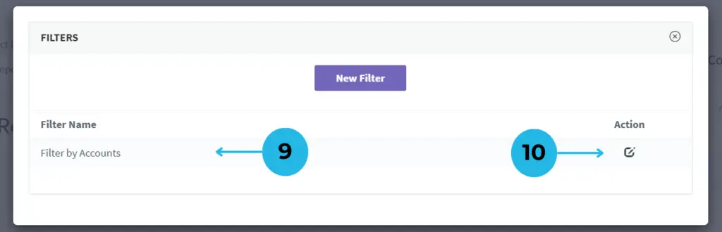
9.Once filters are created, you’ll see a comprehensive list under the Filter Name section, displaying each filter’s name.
10.Easily modify filter names by clicking the Edit icon in the Action column.
Creating a Table Using Filters in PivotXL
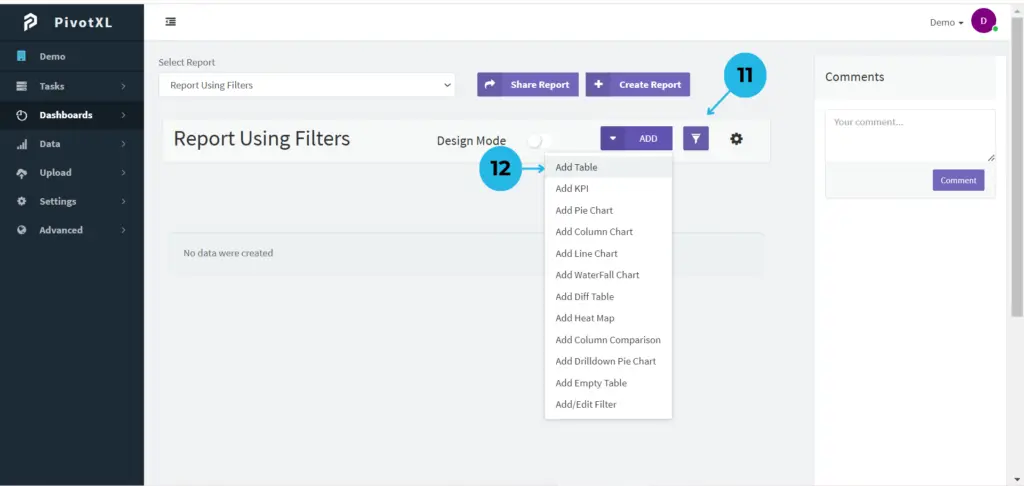
11.After creating filters, close the pop-up to return to the report page. A new Filter Management Icon will appear, allowing you to manage the filters within the report seamlessly.
12.To apply a filter in the report table, click the ADD option and select Add Table to bind your data to the newly created filter effortlessly.
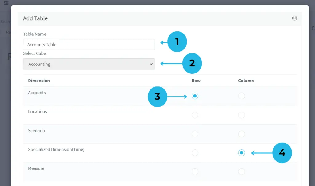
1.Provide a meaningful name for easy identification.
2.Choose the cube associated with your table data.
3.Select the dimension for table rows to organize data effectively.
4.Define the dimension for table columns for structured data representation.
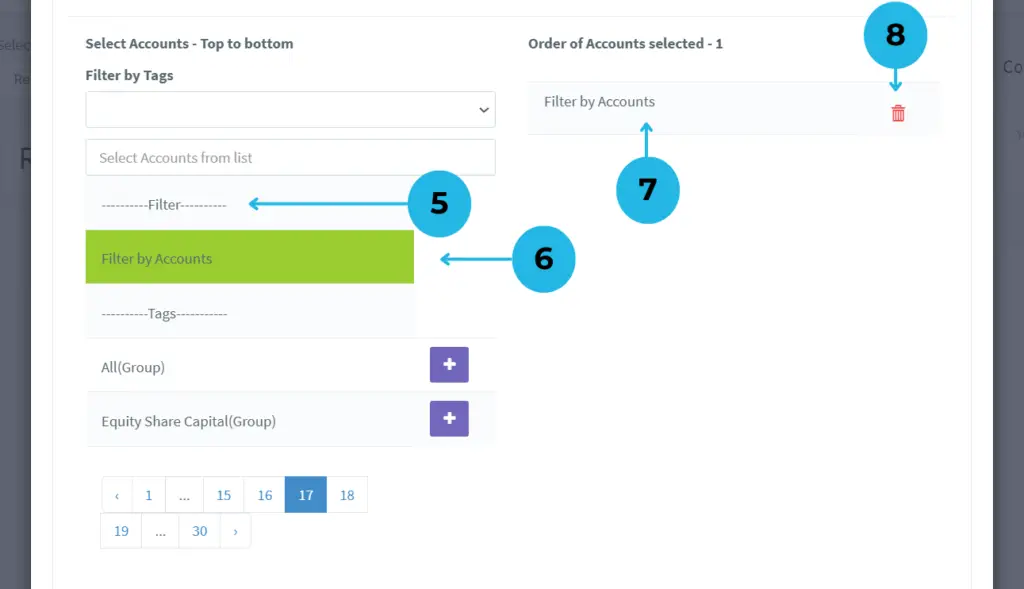
5.Access the Filter Section to see available filters and select your preferred one.
6.After clicking the Plus Icon, the selection turns green, confirming the applied filter.
7.The selected accounts for rows are displayed.
8.Modify selections by using the Delete Icon to remove any unwanted accounts.
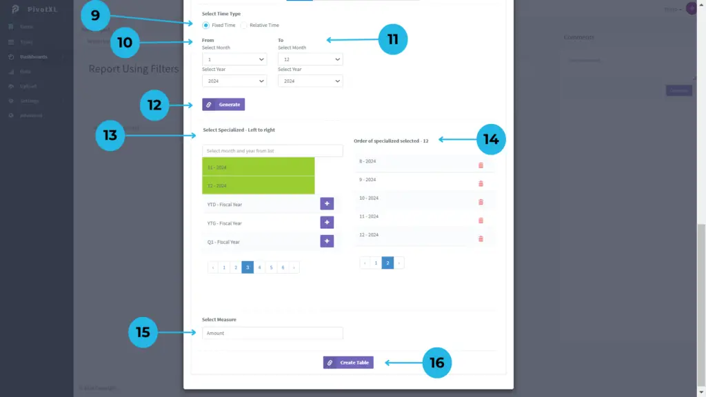
9.Set the time type for your report, choosing Fixed Month Time.
10.Select the starting month and year for the data.
11.Choose the ending month and year for the data.
12.Click Generate to create time segments by month and year.
13.View the generated months and years in the table columns.
14.Click the Plus Icon to apply the selection, highlighted in green.
15.Select the relevant measure for the table report.
16.Click Create Table to finalize and generate your custom table.
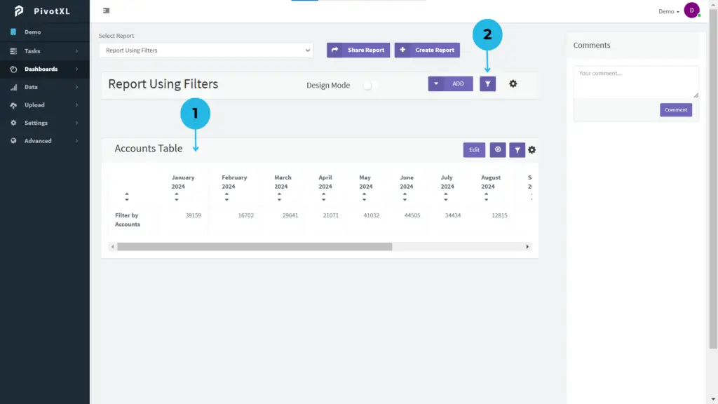
1.The table is created, displaying the table name in the report.
2.Click the filter icon to manage filters within the report.
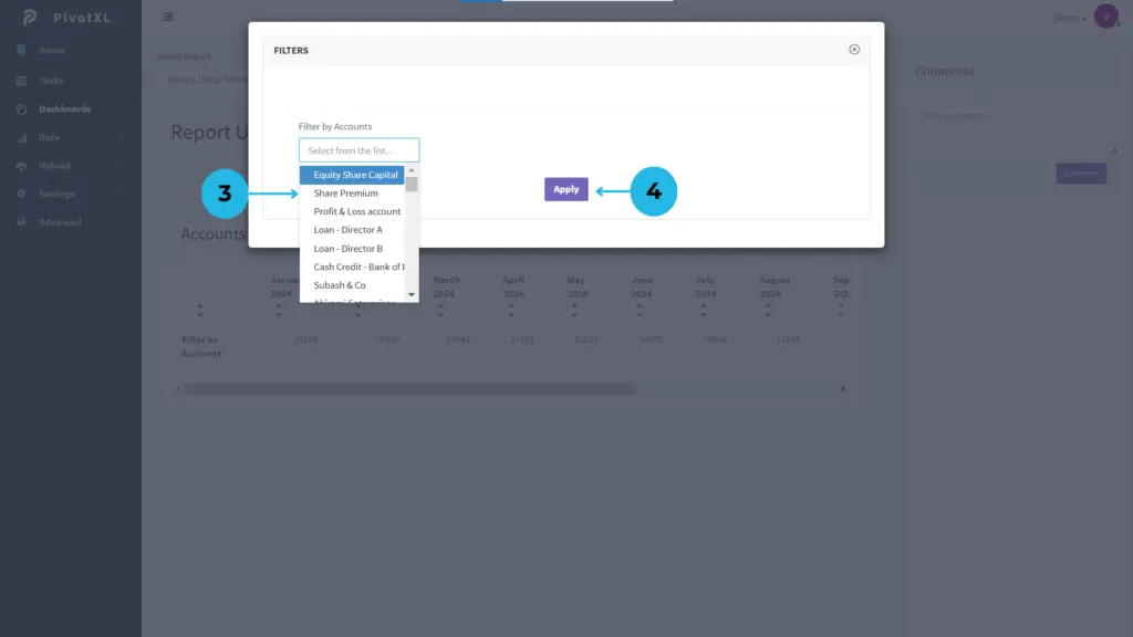
3.A new pop-up opens, displaying the default account filter, allowing you to modify the account as needed.
4.After making changes to the filter, click the Apply button to update the filter with your modifications.
Enhancing Data Analysis with Filter Customization
1.A new table is created, showcasing options to Edit, Download, and access Settings.
2.Click the filter icon within the table to view the filter details currently applied.
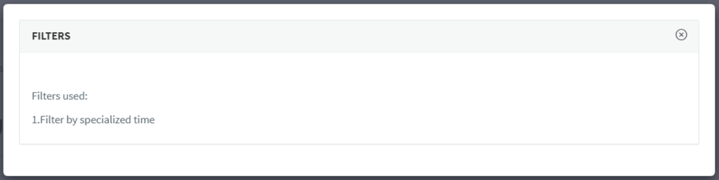
See the details of the filters applied to the table for a clear overview.
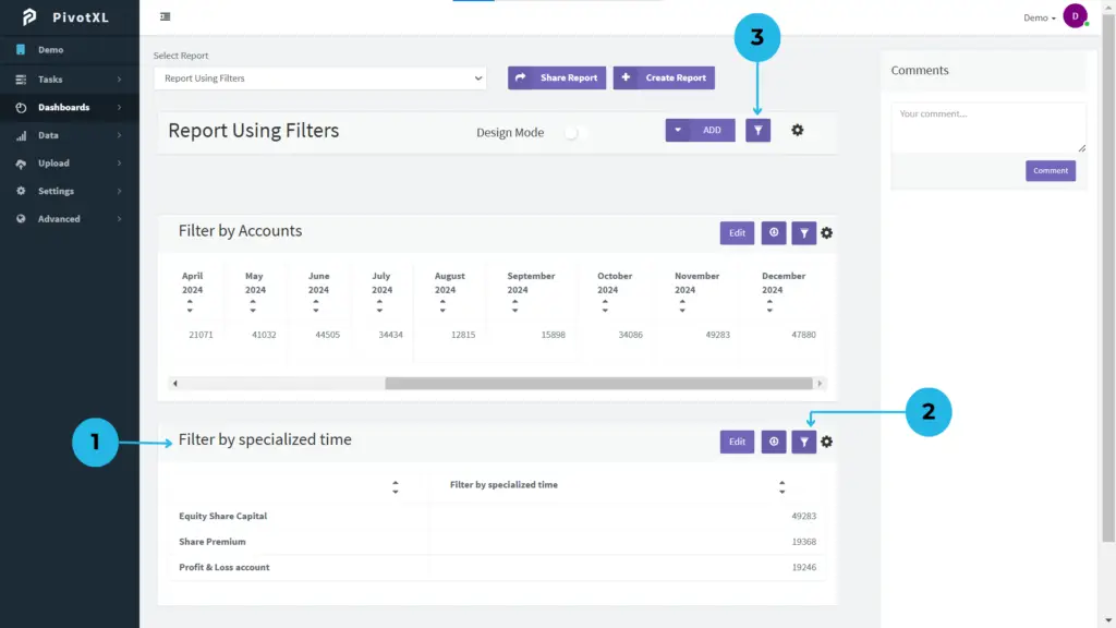
3.To manage all filters, click the report filter icon for comprehensive filter control and customization.
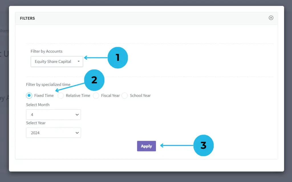
1.The filters list appears in a new pop-up for managing filters in the report. The first filter is based on accounts.
2.The second filter specializes in time, which has been adjusted to a fixed time filter for greater precision.
3.Click the Apply button to confirm and apply the changes to the filters.
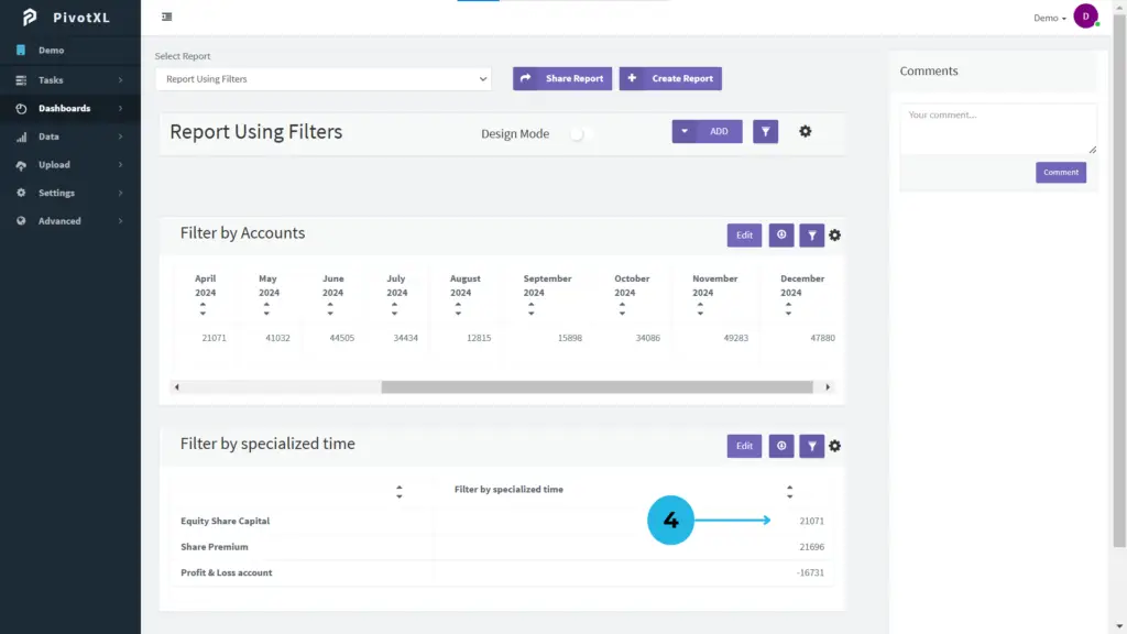
4.The table updates dynamically based on the applied specialized time filter.
Applying Filters in PivotXL Excel
Filters in PivotXL Excel empower you to analyze data reports from multiple perspectives by focusing on specific dimensions. They offer an intuitive and efficient way to set up filters directly within Excel sheets, providing flexibility for dynamic data views. With mapped cells seamlessly integrated, filters make data exploration and reporting more streamlined and insightful.
Creating a New Filter in PivotXL Excel
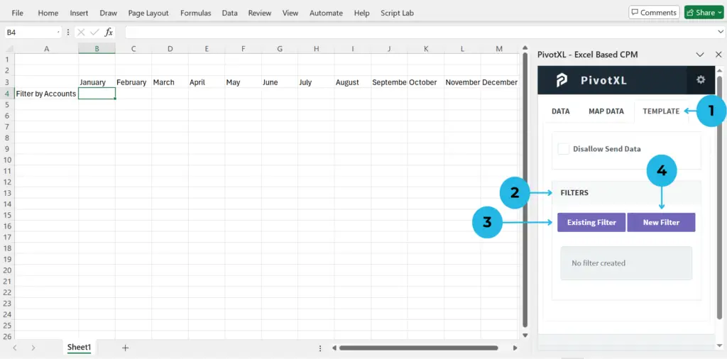
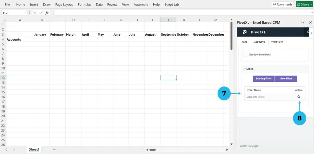
1.After logging into the PivotXL Excel Add-On, navigate to the top menu and click on the Template tab to create or manage filters in your Excel sheet.
2.The filter section will be displayed within the template. If no filters have been created, the section will appear empty.
3.If any filters are already applied to the sheet, they will be listed under Existing Filters, providing a clear overview for quick management.
4.To create a fresh filter in the sheet, simply select the New Filter option, enabling you to customize your data views efficiently.
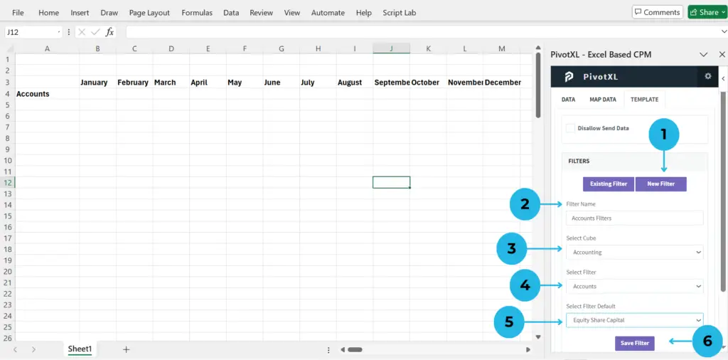
1.Click the New Filter button to start creating a custom filter for your sheet.
2.Provide a meaningful and recognizable name for your filter to easily identify its purpose.
3.Choose the relevant cube to align the filter with your existing report mappings.
4.Select the appropriate dimension to define how the filter operates across its members.
5.Specify a default dimension member to streamline the initial filter configuration.
6.Click the Save Filter button to finalize and store the newly created filter for future use.
7.The newly created filter will appear in the filter section, displaying its name and an edit action icon.
8.Click the Edit icon to update the filter. You can easily rename the filter or change the default dimension members for better customization and refined data views.
Creating a New Filter in PivotXL (Video Tutorial)
Applying Filters in Bulk Map in PivotXL
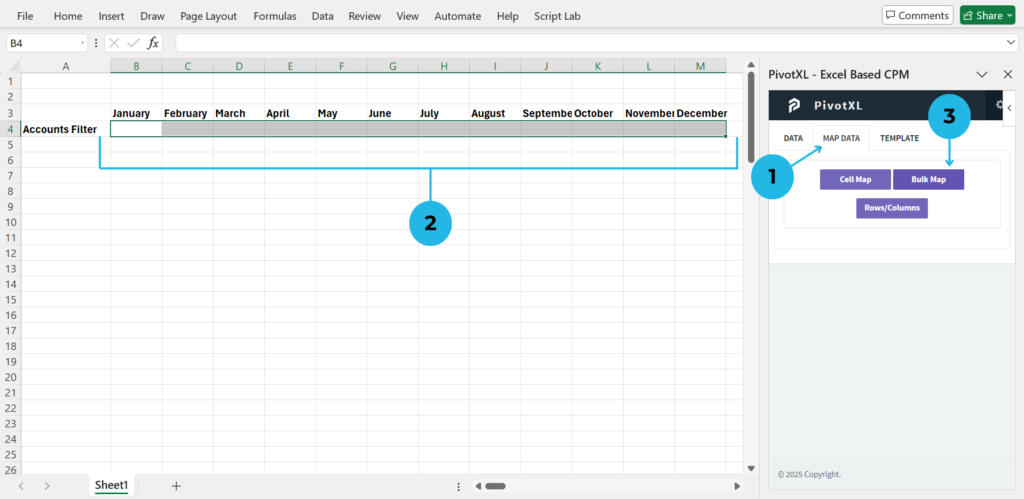
1.Click the Map Data option from the top menu to begin mapping data in your Excel sheet.
2.Choose the specific cells where you want to apply bulk mapping. This allows precise control over data placement.
3.Click the Bulk Map button to instantly map the selected cells, seamlessly integrating the mapped data into your Excel sheet.
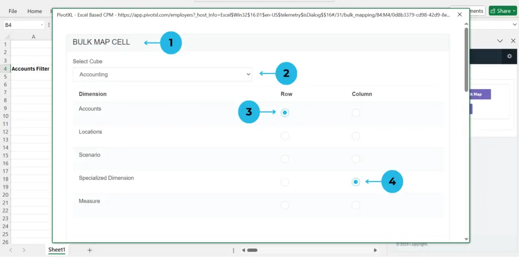
1.Open a new pop-up to configure bulk mapping in your selected cells.
2.Choose the cube relevant to your report for accurate data mapping.
3.Assign the appropriate dimension for rows in the selected cells.
4.Assign the relevant dimension for columns in the selected cells.
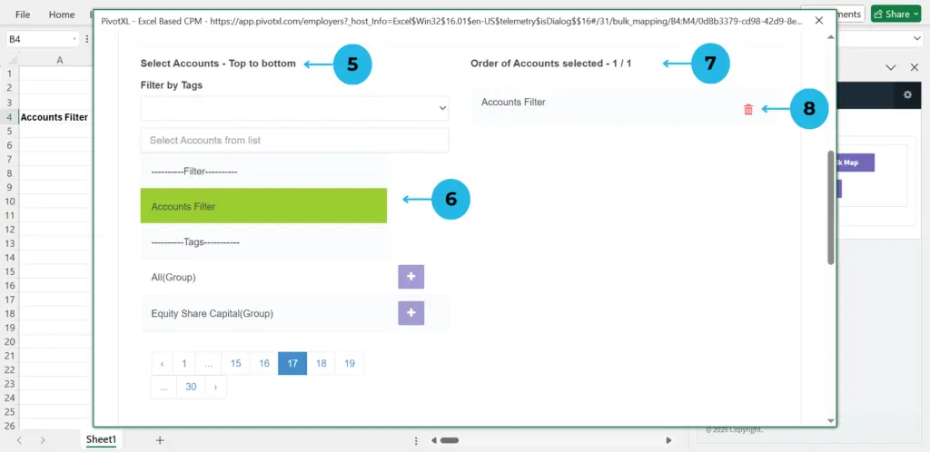
5.View available dimension members and tags. If filters exist, they will be displayed under the Filter Section.
6.Click the Plus Icon next to a filter name to apply it. The selection will turn green to confirm activation.
7.See the selected filters and members with their order.
8.Use the Delete Icon to adjust the list.
9.Choose dimension members for your cube combination mapping.
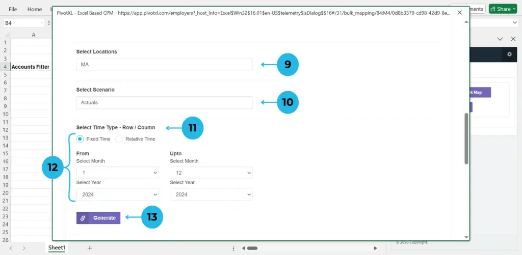
10.Specify whether the time type applies to rows or columns.
11.Select the specialized time for the column mapping.
12.Click the Plus Icon to confirm the selection. The icon turns green upon successful selection.
13.Press the Generate button to create a list of months based on your selected time criteria.
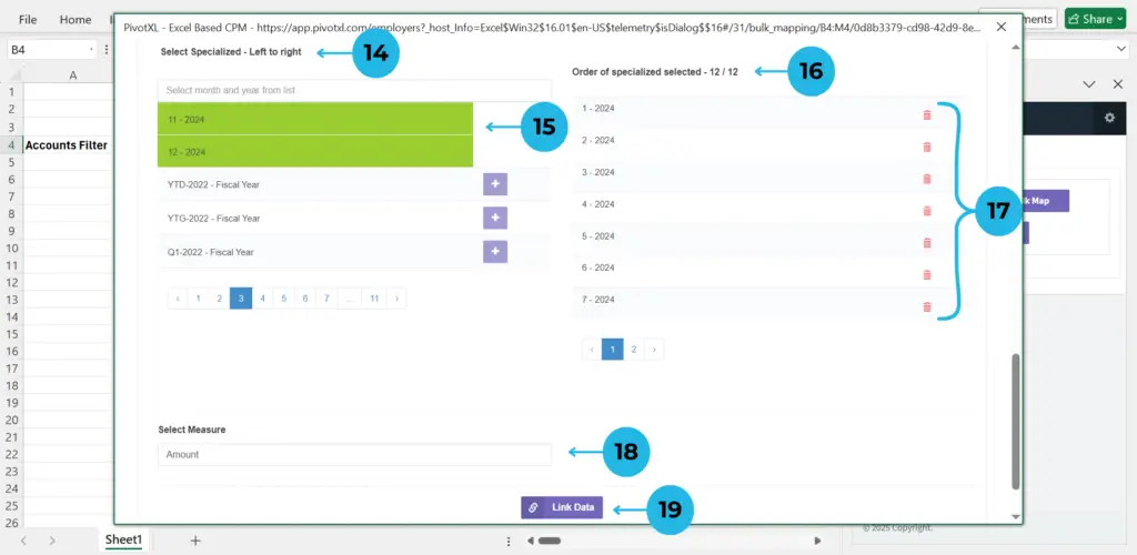
14.Choose the specialized time for the column to customize the time-based data mapping.
15.Click the Plus Icon to select specific months. The selection turns green upon activation.
16.See selected months with their order.
17.Use the Delete Icon to make changes.
18.Choose the appropriate measure dimension member for your report.
19.Ensure all sections are properly configured and click Link Data to Mappings to complete the process.
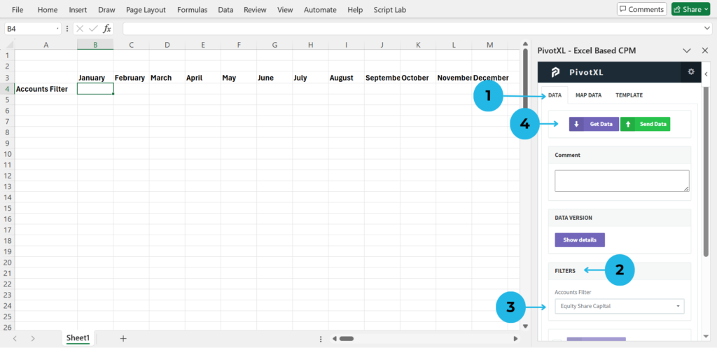
1.Click the Data option from the top menu to organize and fetch data efficiently.
2.The filter section displays existing filters for streamlined data selection, highlighting the current filter applied through mapping.
3.Choose your preferred dimension member to refine and fetch specific data sets based on your mappings.
4.Click the Get Data button to retrieve data from the cube combination, applying the selected filter for precise results.
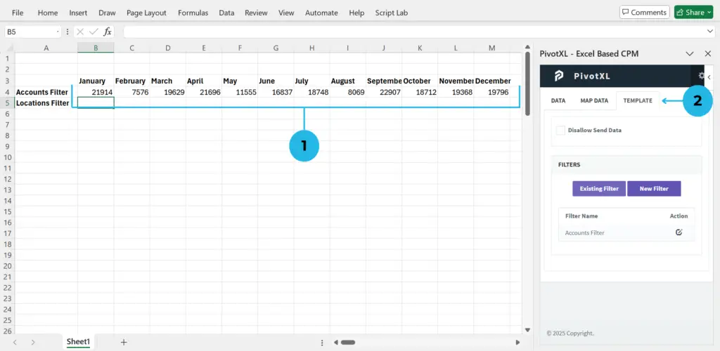
1.The data is fetched and displayed in the mapped cells based on the applied filter.
2.Click the TEMPLATE option from the top menu to see filter details. This section shows the currently available filters for your sheet.