


Introduction
Bubble graphs in Excel are a powerful tool for visualizing complex data in a simple and engaging way. Unlike standard scatter plots, which only use X and Y coordinates to represent data points, bubble charts add a third dimension by varying the size of each bubble based on an additional data value. This unique feature makes them particularly useful when you need to compare large datasets and identify patterns, trends, or relationships between different variables.
What is a Bubble Graph in Excel?
A bubble graph (or bubble chart) is a variation of a scatter plot where:
- The X-axis represents one variable.
- The Y-axis represents another variable.
- The bubble size represents a third variable.
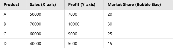
For example, if you are analyzing company sales, you could use:
- Revenue as the X-axis
- Profit as the Y-axis
- Number of Employees as the bubble size
Steps to Create a Bubble Graph in Excel
Follow these simple steps to create a bubble graph in Excel:
Prepare Your Data
Before inserting a bubble graph, ensure your data is structured properly. Your dataset should have three numerical columns:
Insert a Bubble Chart
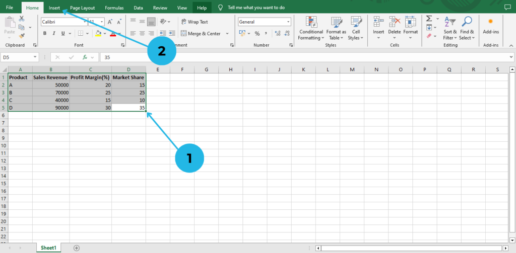
- Open Excel and select your data (excluding headers).
- Click on the Insert tab in the ribbon.
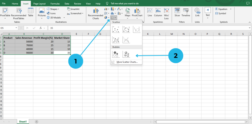
- Go to the Charts group and select Insert Scatter (X, Y) or Bubble Chart.
- Choose Bubble Chart from the dropdown options.
Customize Your Bubble Graph
Once your chart is inserted, you can customize it to enhance readability and appearance:
Add Titles & Labels
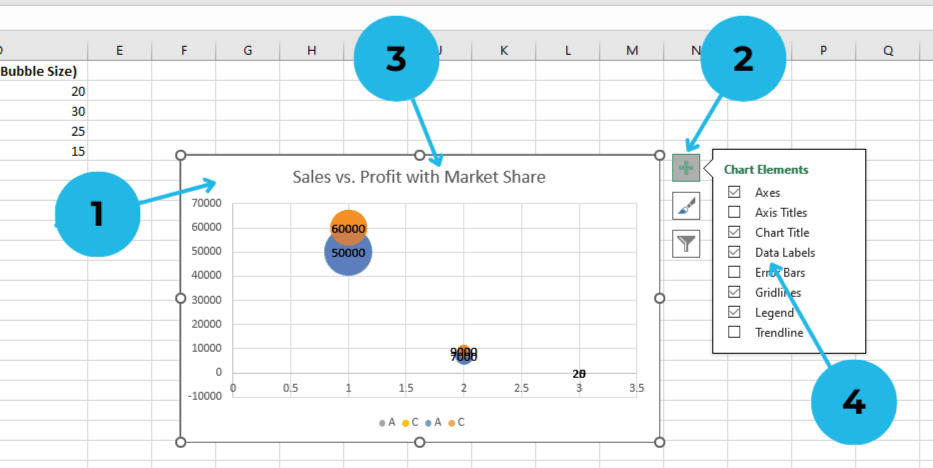
- Click on the chart for Enable + icon
- Go to the Chart Elements button (+ icon).
- Check Chart Title and rename it to something meaningful, such as “Sales vs. Profit with Market Share.”
- Enable Data Labels to display exact values on the bubbles.
Adjust Bubble Colors & Size
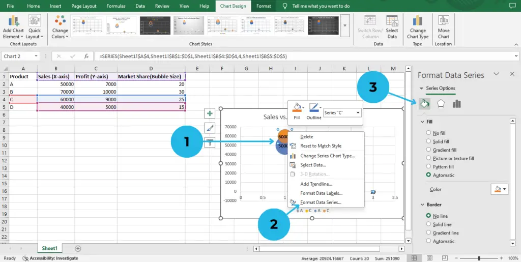
- Click on any bubble to highlight it, then right-click the highlighted bubble.
- Choose Format Data Series.
- Modify the Fill & Border settings to differentiate each bubble.
Adjust Axis Labels & Gridlines
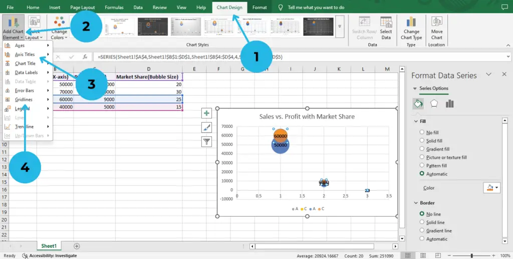
- Go to the Chart Design tab to customize the chart elements.
- Select Add Chart Element to access the dropdown options.
- Use Axis Titles to name your axes appropriately.
- Use Gridlines to enhance clarity.
Fine-Tune the Chart for Better Visualization
- Scale Bubble Sizes: Ensure the bubbles don’t overlap excessively by adjusting the Scale Bubble Size to option in the Format Data Series pane.
- Change Background & Style: Use predefined Excel chart styles under the Chart Design tab for a professional look.
- Sort & Filter Data: Remove outliers or highlight specific data points by filtering your dataset before creating the graph.
Best Practices for Bubble Graphs in Excel
To create a clear and effective bubble graph, follow these key guidelines. First of all, use meaningful data labels by naming your bubbles appropriately so that you can prevent confusion. Moreover, avoid excessive data points, because too many bubbles can clutter the graph and make interpretation difficult. In addition, choose appropriate colors to clearly differentiate categories and enhance readability. Most importantly, ensure your data is accurate, since any inconsistencies in the dataset can lead to misleading analysis.
Conclusion
Bubble graphs in Excel offer an excellent way to analyze and present multi-dimensional data efficiently. Not only that, but they also help visualize complex relationships clearly. In addition, by following this guide, you can create a visually appealing bubble chart to represent relationships between different variables effectively. Moreover, experimenting with different datasets will help you get comfortable with customizing and optimizing your charts. As a result, you’ll gain better insights and improve your data presentations. Ultimately, this will enhance your ability to make data-driven decisions!
“Do you use bubble graphs in Excel for your reports?” If so, let us know.