


A stacked bar chart in Excel is a simple way to show data by stacking different categories in a single bar. This makes it easier to compare how each part contributes to the whole. For example, businesses use it to track sales, analyze trends, and compare data over time. Overall, it helps present information in a clear and organized way
In this guide, we’ll walk you through a step-by-step process to create a stacked bar chart in Excel using PivotXL.
What is a Stacked Bar Chart?
A stacked bar chart displays values for different categories stacked on top of each other. It is useful for:
- Showing how individual parts contribute to a whole.
- Comparing multiple data series over time.
- Visualizing percentage contributions.
Create a Stacked Bar Chart in Excel
Follow these simple steps to create a stacked bar chart in Excel:
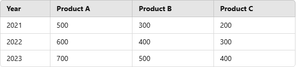
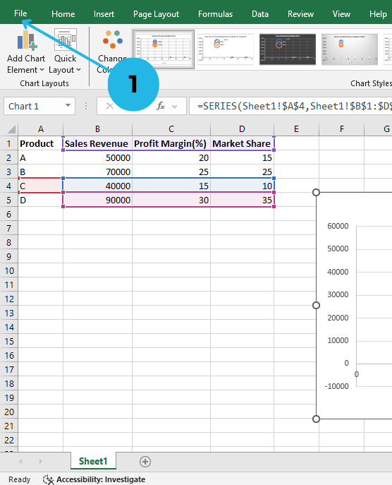
Enter Your Data in Excel
Before creating a chart, ensure your data is structured properly. For example:
Select Your Data and Insert a Stacked Bar Chart
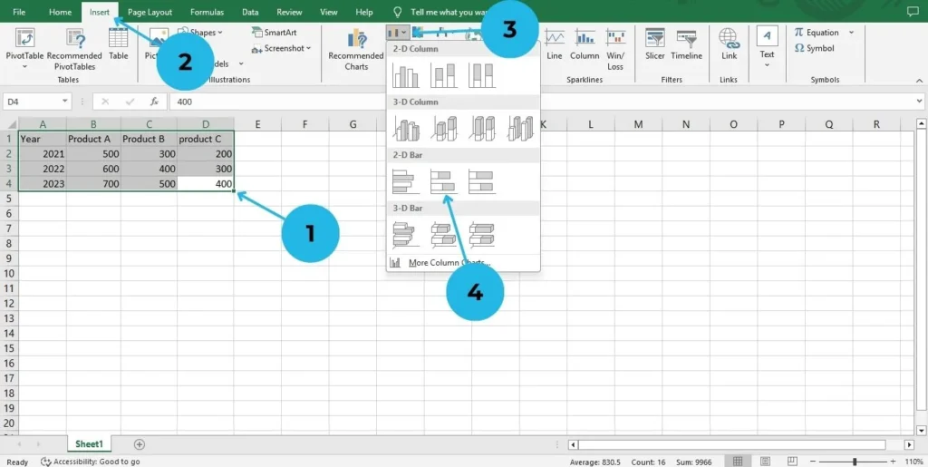
- Select the data including the headers (A1:D4 in the example above).
- Go to the Insert tab in the Excel ribbon.
- Click on Bar Chart under the “Charts” section.
- Select Stacked Bar Chart from the dropdown menu.
Customize the Chart
Once the chart appears, customize it for better readability:
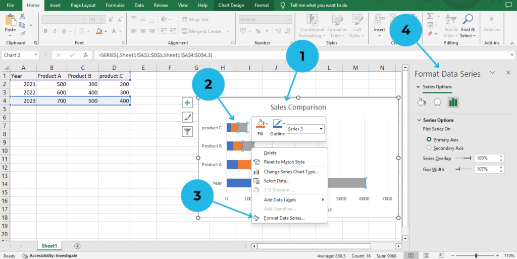
- Add Chart Title: Click on the title and enter a relevant name (e.g., “Sales Comparison”).
- Change Colors: Right-click on the bars.
- Choose Format Data Series and change colors.
- Adjust Axis Labels: Ensure the years are visible and formatted correctly using “Format Data Series” .
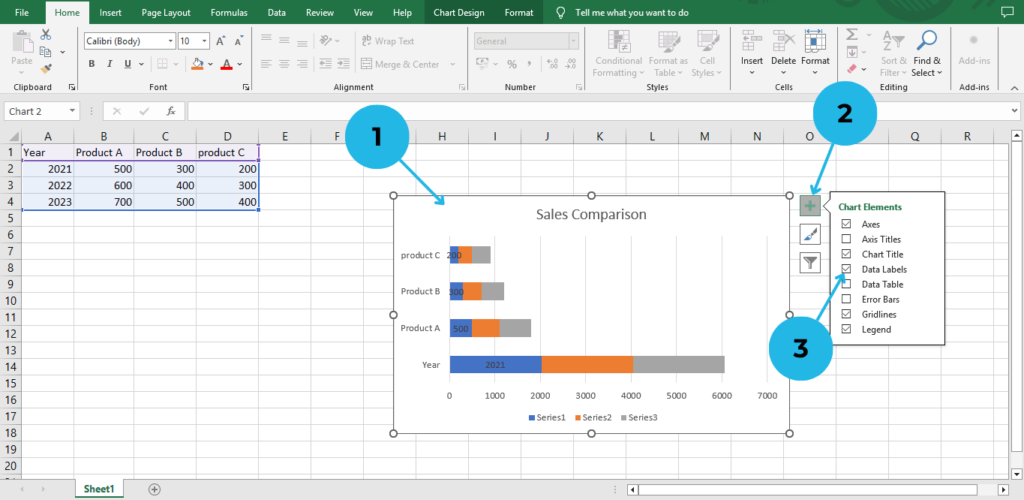
- Add Data Labels: Click on the chart.
- Click on Chart Elements(+ icon)
- Check the “Data Labels” box.
Save and Use Your Chart
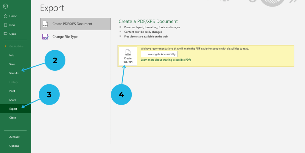
- Click File option to open save option.
- Click on save as option to save your file.
- Click on export option tom export your file.
- Click on Create PDF/XPS option save your file as PDF.
Tips for Using Stacked Bar Charts Effectively
- Use a stacked bar chart when comparing multiple groups within a category, as it helps show how each part contributes to the whole.
- However, avoid too many categories to keep the chart readable and easy to understand.
- Additionally, choose contrasting colors for better visualization, so that each section stands out clearly.
Conclusion
Creating a stacked bar chart in Excel is not only simple but also a powerful way to analyze and present data effectively. Moreover, it allows you to compare multiple categories, visualize trends, and showcase part-to-whole relationships in an easy-to-understand format. Whether you’re working on sales reports, business analysis, or academic projects, stacked bar charts ultimately make your data more meaningful and visually appealing.
Furthermore, by following the step-by-step guide in PivotXL, you can quickly create a professional-looking stacked bar chart and customize it to fit your needs. Additionally, adding labels, adjusting colors, and optimizing your chart for clarity will significantly enhance your presentations and reports.
Therefore, start using stacked bar charts today to improve your Excel data visualization skills and make better data-driven decisions. With just a few clicks, you can effortlessly transform raw data into insightful visuals that tell a clear and compelling story.
Learn about Bubble charts in excel.