


A clustered bar graph in Excel is a simple and effective way to compare different sets of data side by side. For example, if you are analyzing sales, survey results, or financial data, this chart helps you easily identify patterns and trends. In this step-by-step guide, we will walk you through the exact process of creating a clustered bar graph. By following these instructions, you will learn how to organize your data, build a professional-looking chart, and customize it for better clarity. Whether you are a beginner or an experienced Excel user, this guide will make the process easy to understand and apply.
What is a Clustered Bar Graph?
A clustered bar graph is a useful chart that groups similar data together, making it easier to compare different categories. Generally, it is widely used in business and data analysis to quickly identify trends and patterns.
For instance, if you have sales data for three products across four regions, a clustered bar graph will clearly display the sales of each product side by side within each region. As a result, you can easily determine which product performs best in each area.
Moreover, this type of chart allows you to compare multiple sets of data at once, making your reports more organized and easier to understand. Therefore, by using a clustered bar graph, you can present complex data in a simple and visually appealing way, improving the clarity of your analysis.
Do you know about Bubble Graphs? Check them out in PivotXL.
Step-by-Step Guide to Creating a Clustered Bar Graph in Excel
Enter Your Data
Before creating a clustered bar graph, it is important to first organize your data properly in an Excel spreadsheet. This way, you can ensure accuracy and make the chart creation process much smoother. Additionally, having well-structured data helps in generating a clear and visually appealing graph for better analysis.
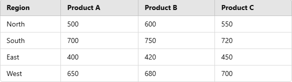
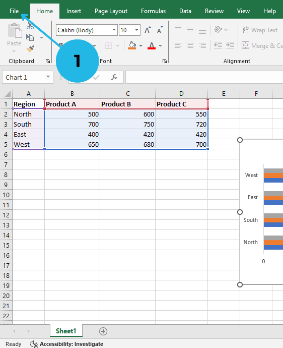
- Open Microsoft Excel and enter your data in a table format.
- Ensure your data has headers (e.g., “Region,” “Product A,” “Product B,” “Product C”).
Example Data Table:
Insert a Clustered Bar Graph
Now, let’s quickly move forward and create the clustered bar graph in Excel step by step.
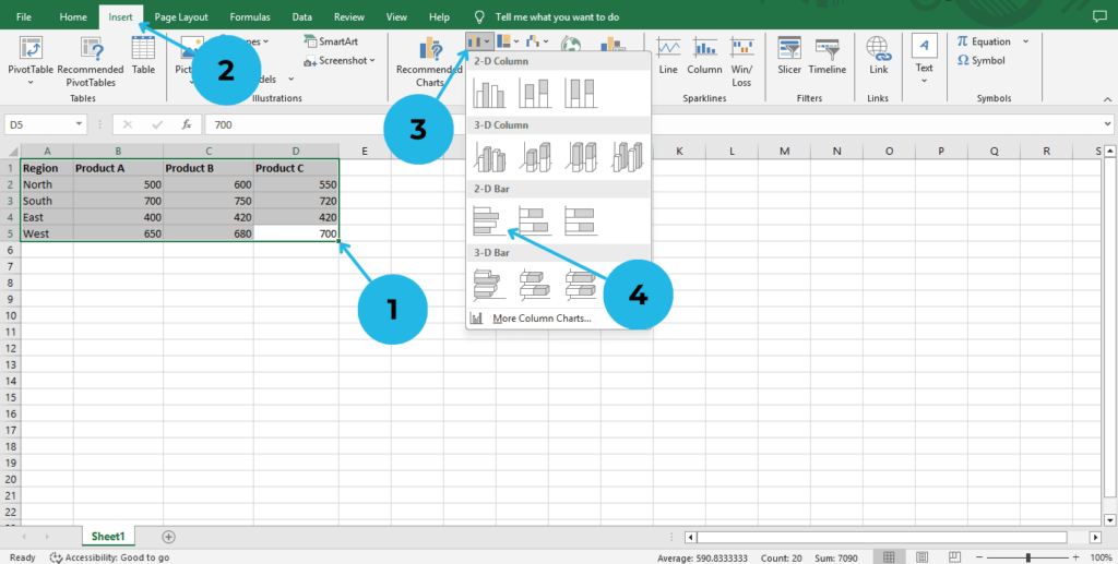
- Select the data range (including headers) in your Excel sheet.
- Go to the Insert tab in the Excel ribbon.
- Click on Bar Chart from the Charts group.
- Choose Clustered Bar Chart from the dropdown options.
At this point, as you carefully follow the steps, a basic clustered bar graph will automatically appear on your Excel sheet. Consequently, you can begin customizing it to better suit your data visualization needs. Moreover, this chart will help you compare multiple data sets more effectively, making your analysis clearer and more insightful.
Enabling and Customizing the Chart Title
To make your chart more readable and visually appealing, follow these customization steps:
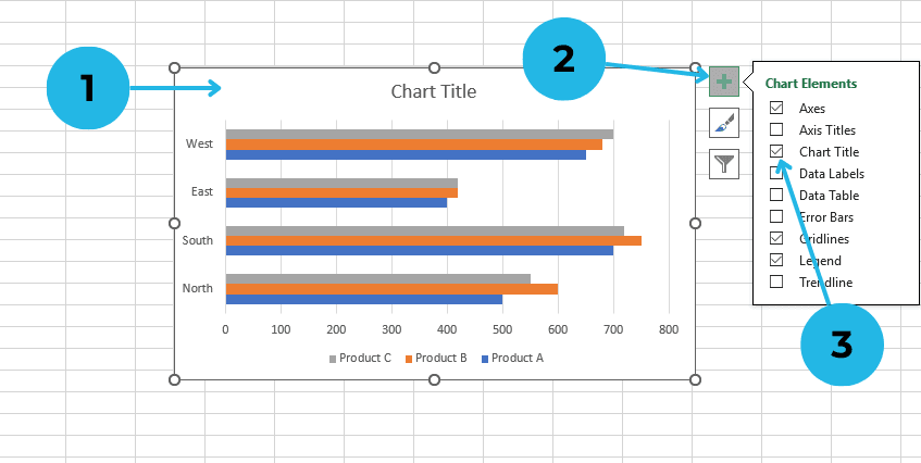
- Add a Chart Title: click on the chart.
- Go to Chart Elements (usually found by clicking the “+” icon on the chart).
- Select Chart Title and enter a relevant title that clearly describes your data.
Customizing the Chart
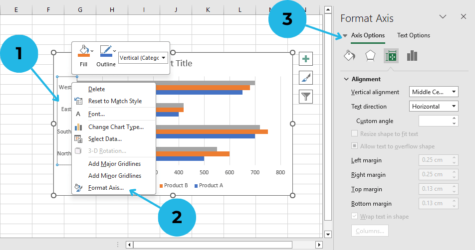
- Adjust Axis Labels: Locate the X-axis (horizontal) and Y-axis (vertical) labels on your chart. Right Click on the text to select it.
- Click on Format Axis Option.
- Customize the X-axis (horizontal) and Y-axis (vertical) on your chart using the Format Axis option.
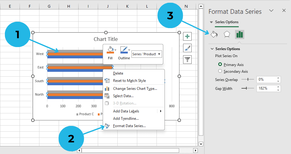
- Change Colors: Right click on a bar.
- Click on Format Data Series.
- Change colors in Shape Fill, and select a new color scheme.
Save and Export Your Chart
Once you are completely satisfied with your clustered bar graph in Excel, you can easily save it and seamlessly use it in presentations or reports.
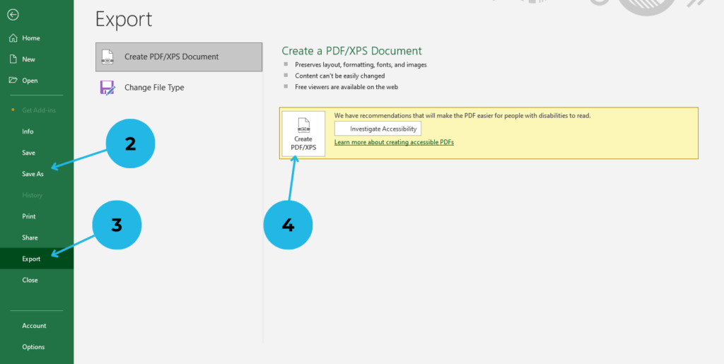
- Click on the File tab
- Select Save As to store your Excel workbook.
- To export the chart: Click on Export option
- Choose Create PDF/XPS option for use in reports and presentations.
Conclusion
Creating a clustered bar graph in Excel is not only simple but also highly effective for visualizing comparisons. In fact, by carefully following these easy steps, you can significantly enhance your reports and presentations with professional-looking charts. Furthermore, using clustered bar graphs allows you to display complex data in a clear and organized manner. Not only that, but customizing your chart with colors, labels, and legends also makes it even more visually appealing. Therefore, why wait? Start applying these steps today with your own data, and as a result, you will quickly see a noticeable difference in your presentations and reports!
“Discover more about creating a clustered bar graph in Excel and improve your data visualization skills.”
PivotXL enhances Excel users’ productivity by centralizing data and automating reporting. Eliminating your manual workload and improving data accuracy accuracy. Try it for free or explore our website to learn more.