


Introduction:
When working with data in Excel, visual representation plays a crucial role in quickly identifying trends and patterns. One powerful yet simple tool for this is Sparkline in Excel—mini charts that fit within a single cell. Whether you want to track sales performance, highlight trends, or compare data points, Sparklines provide a compact and efficient way to visualize data without taking up too much space.
In this guide, we’ll walk you through everything you need to know about Sparklines in Excel. First, we’ll show you how to create them step by step. Then, we’ll explore different ways to customize them to better suit your data. Finally, we’ll discuss best practices to help you use them effectively in your spreadsheets. Let’s dive in!
Check out for more in Microsoft support.
What is a Sparkline in Excel?
Sparklines are small charts that fit inside individual cells in a sheet. Because of their condensed size, sparklines can reveal patterns in large data sets in a concise and highly visual way. Use sparklines to show trends in a series of values, such as seasonal increases or decreases, economic cycles, or to highlight maximum and minimum values. A sparkline has the greatest effect when it’s positioned near the data that it represents. To create sparklines, you must select the data range that you want to analyze, and then select where you want to put the sparklines. Because of their simplicity, they are perfect for gaining quick insights without overwhelming your spreadsheet with large charts.
- Line Sparkline: This type of Sparkline is ideal for displaying data trends over time, making it easier to spot patterns, increases, or declines at a glance.
- Column Sparkline: Instead of lines, this Sparkline uses vertical bars to represent values, which helps compare data points more effectively. It’s especially useful when analyzing fluctuations in data.
- Win/Loss Sparkline: Unlike the other types, this Sparkline focuses on showing positive and negative values clearly. It’s perfect for tracking performance indicators, such as wins and losses in a dataset, making it easy to distinguish between gains and setbacks.
How to Insert a Sparkline in Excel:
Follow these simple steps to add Sparkline in Excel:
Step 1: Select Your Data
- Open your Excel worksheet.
- Highlight the data range you want to visualize.
Step 2: Insert the Sparkline
- Go to the Insert tab in the Ribbon.
- Locate the Sparklines group and choose the type you want (Line, Column, or Win/Loss).
- In the Create Sparklines dialog box:
- Select the data range.
- Choose the location where you want the Sparkline to appear.
- Click OK.
You will now see a Sparkline appear in the selected cell.
Customizing Sparkline in Excel:
To change the type of Sparkline in your Excel sheet, follow these easy steps:
Changing Sparkline Type:
- First, click on the cell that contains the Sparkline you want to modify.
- Next, go to the Sparkline tab in the Excel ribbon.
- Then, select a different Sparkline type—Line, Column, or Win/Loss—based on how you want to visualize your data.
Adding Markers (for Line Sparklines):
- First, select the cell that contains the Sparkline you want to modify.
- Next, navigate to the Sparkline tab in the Excel ribbon.
- Then, check the Markers option to make key data points stand out.
Changing Colors:
- First, select the Sparkline you want to modify.
- Next, click on the Sparkline Color option in the Sparkline tab to choose a new color that better suits your data.
- For column Sparklines, use Marker Color to differentiate high and low points.
Practical Example: Using Sparklines for Sales Data
Imagine you have monthly sales data and want to see trends at a glance:
| Month | Sales ($) |
|---|---|
| Jan | 5000 |
| Feb | 4500 |
| Mar | 6000 |
| Apr | 7000 |
| May | 6500 |
You can insert a Line Sparkline in the next column to track how sales fluctuate over time.
Removing a Sparkline:
To remove a Sparkline from your Excel sheet, follow these simple steps:
- First, select the cell that contains the Sparkline you want to delete.
- Next, navigate to the Sparkline tab in the Excel ribbon. Then, click on the Clear option.
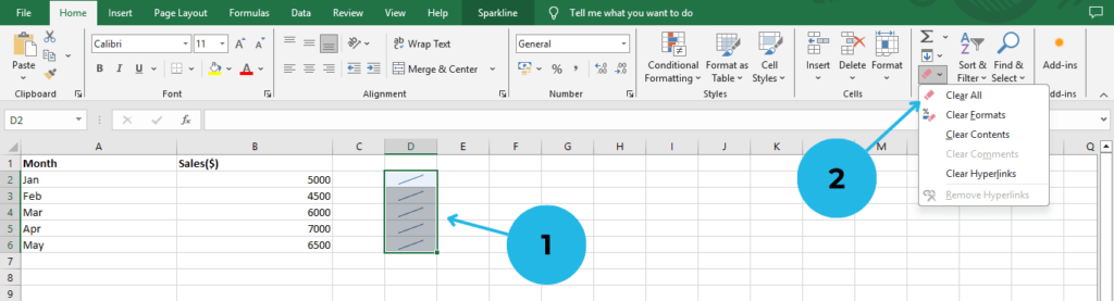
By following these steps, you can easily remove any unwanted Sparklines without affecting the rest of your data.
Conclusion:
Sparklines in Excel are an excellent way to visualize trends in a compact and efficient format. Whether you are tracking sales, monitoring expenses, or evaluating performance, these mini charts make it easier to analyze data at a glance. Unlike full-sized graphs, Sparklines take up minimal space while still providing valuable insights. So, if you’re looking for a quick and effective way to enhance your data analysis, give them a try in your Excel sheets and see the difference they can make!
For more Excel tutorials, stay tuned to PivotXL!