


A bubble plot in Excel is a type of scatter plot that displays data points as bubbles instead of dots. These bubbles represent three dimensions of data: X-axis, Y-axis, and bubble size. As a result, they make an effective tool for visualizing trends and relationships in complex datasets.
In this guide, we’ll walk you through the steps to create a bubble plot in Excel, ensuring easy understanding with practical examples. So, let’s get started!
Learn more about bubble plot in excel.
Why Use a Bubble Plot in Excel?
Bubble plots are particularly useful because they help you:
- Compare multiple variables in a single chart.
- Identifying trends and patterns in large datasets.
- Enhancing presentations and reports with a visual impact.
By using a bubble plot, you can present your data in a more meaningful way. Consequently, this makes it easier to interpret and analyze.
How to Use Bubble Plot in Excel?
Prepare Your Data
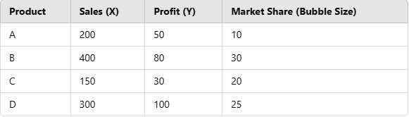
Before creating a bubble plot in Excel, you need to organize your data properly. You will need three columns:
- Column A: X-axis values (e.g., sales numbers)
- Column B: Y-axis values (e.g., profit margins)
- Column C: Bubble sizes (e.g., market share percentages)
Example Dataset:
Once your data is ready, you can move on to inserting the chart.
Insert a Bubble Chart
Now, let’s create the bubble plot step by step:
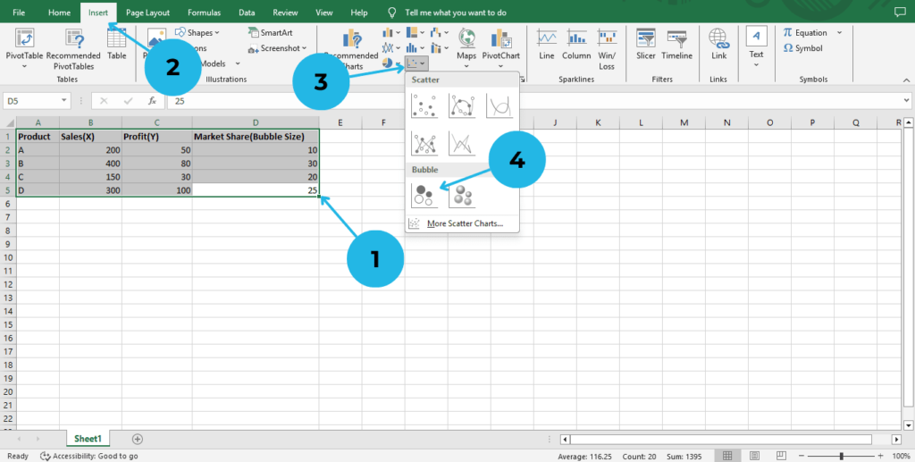
- Select Your Data – Highlight the X, Y, and bubble size columns.
- Click on the Insert tab in the Excel ribbon.
- In the Charts section, click on Insert Scatter (X, Y) or Bubble Chart.
- Choose Bubble Chart from the options.
Customize Your Chart
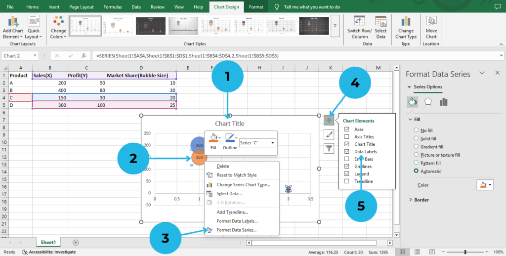
- Add Titles: Click on the chart title and enter a relevant name.
- Adjust Bubble Colors: Right-click a bubble.
- Click on Format Data Series and customize on Fill & Line.
- Label Data Points: Click anywhere on the chart and click on Chart Elements.
- Select Data Labels.
After completing these steps, you will have a basic bubble plot in Excel. However, to make it more insightful, let’s move on to formatting and customization.
Format and Customize the Bubble Plot
To improve the readability of your chart, consider these customizations:
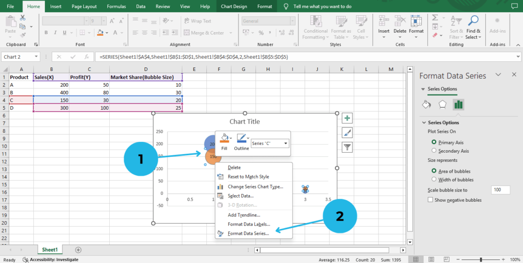
- Resize Bubbles: Right-click on a bubble.
- Click on Format Data Series > Bubble Size Scale.
- Change Axis Labels: Click on each axis to edit the labels for clarity.
- Click on the Axis labels to edit them and customize their appearance as needed.
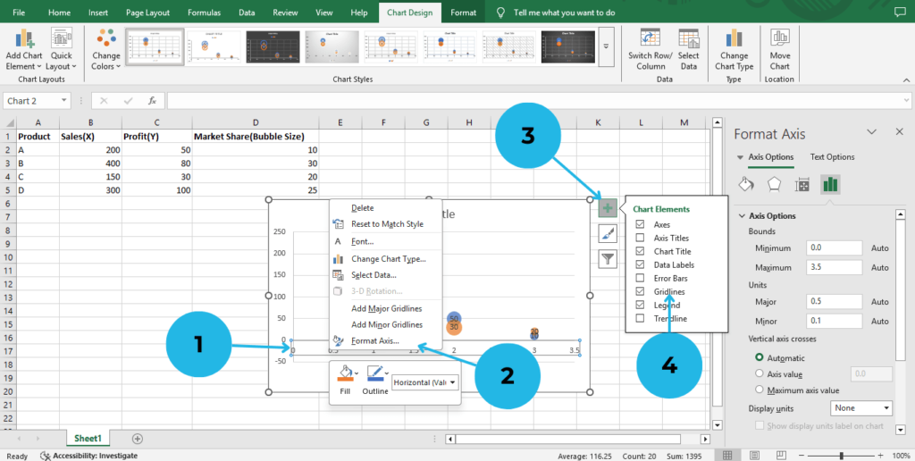
- Add Gridlines: Go to Chart Elements.
- Select Gridlines for better visibility.
These small adjustments can make your chart more visually appealing and easier to understand.
Interpret the Bubble Plot
Once you’ve created the bubble plot in Excel, it’s important to analyze the data effectively:
- Larger bubbles indicate higher market share.
- Higher positions on the Y-axis represent better profit margins.
- Values on the X-axis show sales performance.
By understanding these elements, you can gain deeper insights into your data.
Conclusion
A bubble plot in Excel is a fantastic tool for visualizing three-dimensional data. By following these simple steps, you can create an effective chart that enhances your data analysis and presentations. So, why not give it a try? Additionally, experimenting with different datasets and formatting options will help you gain a deeper understanding of how bubble plots work. The more you practice, the more confident you will become in using this chart type for your reports and insights.
Furthermore, if you found this guide helpful, don’t stop here! There are many other Excel features and charting tools that you can explore. Not only will learning more about Excel boost your data visualization skills, but it will also make your work more efficient. Therefore, keep practicing and refining your skills to master Excel charts.
For even more Excel tutorials, check out our latest guides on PivotXL, where we cover everything from basic functions to advanced charting techniques!