


The PivotXL Dashboard is a robust tool designed for comprehensive financial analysis. It enables you to generate high-level reports while providing the flexibility to drill down into detailed account-level data. With its intuitive features, you can uncover insights that drive better decision-making and a deeper understanding of your financial performance.
Creating Tables
Tables in PivotXL offer a structured and efficient way to manage, view, and update financial data. They are designed to handle complex data sets with ease, providing users with greater flexibility and control.
- Simplified Data Viewing: Organize and display vast amounts of data in a digestible format.
- Effortless Data Updates: Quickly make corrections, add new values, or update existing data directly within tables.
- Customizable Layouts: Adjust tables to fit your reporting preferences, ensuring reports align with your business needs.
- Efficient Data Handling: Manage large and complex datasets with ease, saving time and enhancing accuracy.
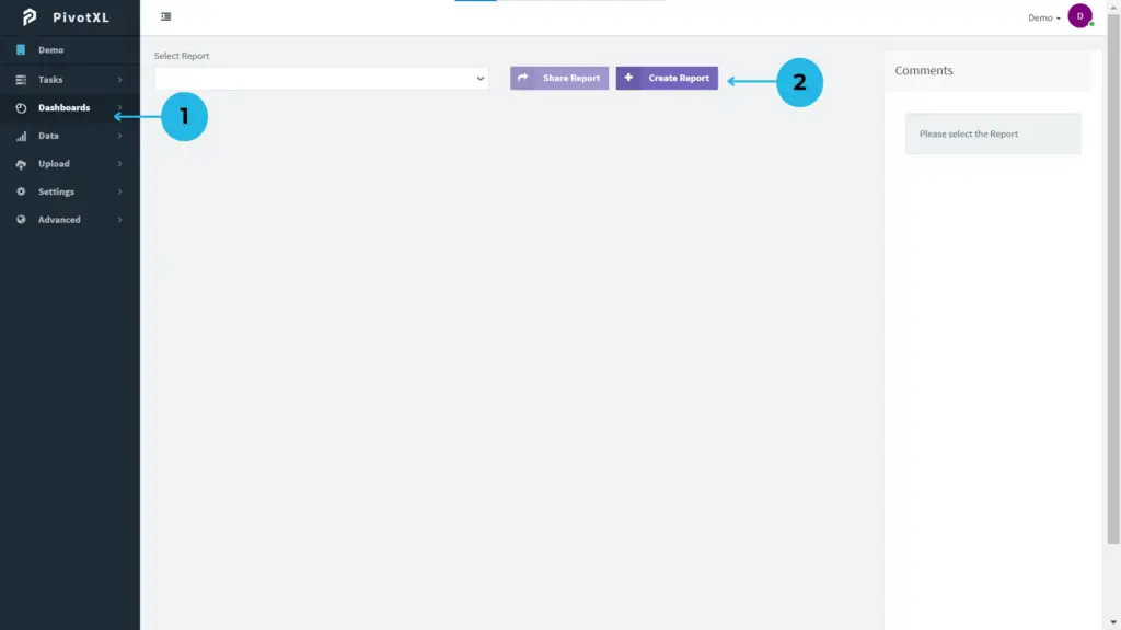
1.Log in to the PivotXL application and navigate to the Dashboards option from the left-hand menu to create reports and drill down into accounts.
2.Click on the Create Report button to generate a report, such as a yearly sales budget.
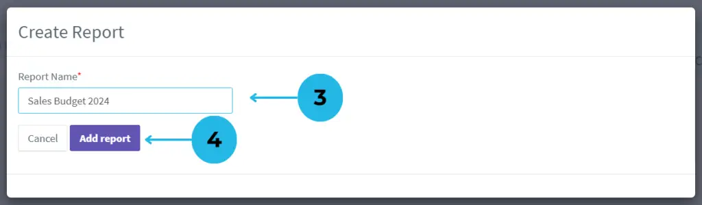
3.Assign a meaningful name to your report, e.g., ‘Sales Budget 2024’, for easy identification and organization.
4.Click the Add Report button to create and set up your report page, ready for customization.

1.Select the ADD button to access a variety of options for creating and customizing your report.
2.Click on the Add Table option to create a structured table for presenting your data effectively.
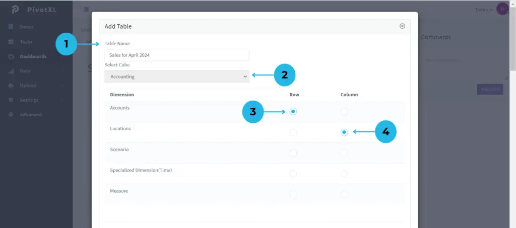
1.Assign a name to the table for easy identification and organization.
2.Choose the cube that suits your reporting needs.
3.Configure the Row to the Accounts Dimension for detailed categorization.
4.Assign the Column to the Locations Dimension for data segmentation.
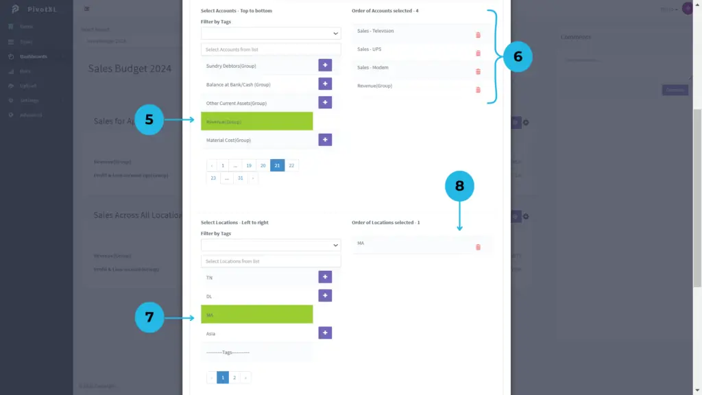
5.Select Accounts for the Row and click the plus icon to add them. Once selected, the color will change to green, indicating success.
6.The selected Accounts list will display in order, allowing you to make modifications if needed.
7.Select Location for the Column and click the plus icon to add them. Similarly, the color will change to green after selection.
8.The selected Location list will display in order, with options for modification.
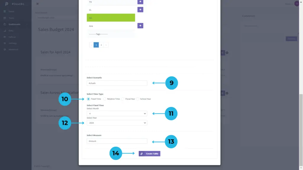
9.Choose Actuals as the Scenario to reflect accurate data.
10.Set the time type to Fixed Time for consistent reporting.
11.Select ‘April’ as the Fixed Time Month (e.g., Month 4).
12.Select ‘2024’ as the Fixed Time Year.
13.Choose Amount as the Measure for precise value representation.
14.Click the Create Table button to finalize and generate your customized table.
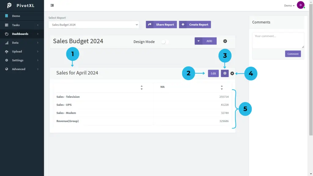
1.The table is now successfully created in the dashboard and linked to the report.
2.Click the Edit button to modify the account values and update them as required.
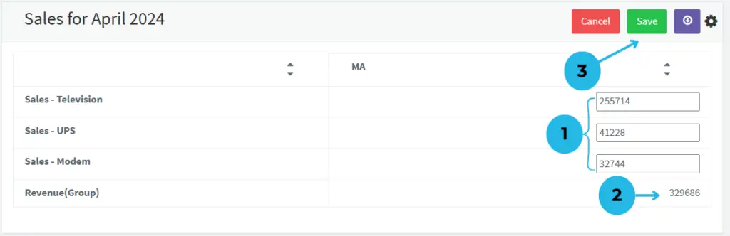
- The values in the table are displayed in editable fields, allowing you to easily make changes and update them as needed.
- The Tags in this table are non-editable, as they are specifically designed for grouping purposes.
- After modifying the values, click the SAVE button to update the table with the new values seamlessly.
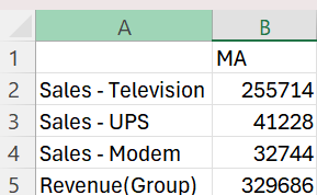
3.Use the Download icon to export the report in CSV file format for further analysis or sharing.
4.Click the Settings icon to effortlessly modify the table’s configuration and include value formats for a more customized and polished presentation.
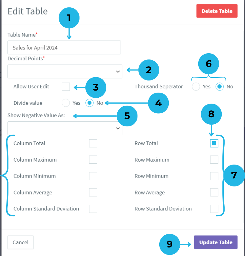
- Easily update the table name to reflect its purpose or content.
- Customize the decimal points to control how values are displayed in the table for precision.
- Use the checkbox to allow editing access for other users as needed.
- Configure the table to show or not show divided values, depending on your reporting needs.
- Choose how negative values are displayed in the report, with multiple formatting options available
- Toggle Yes/No for the Thousand Separator to enhance table readability.
- Leverage advanced options to summarize total values and uncover performance variances directly from the table report.
- Select the Row Total checkbox to easily analyze total values at a glance.
- After verifying all modifications, click the Update Table button to apply your changes and update the table.
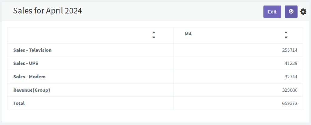
The table now includes a new row at the bottom that displays the total value for all rows.
5.This table represents the Accounts and their values for the Sales Accounting Report, providing a clear view of financial performance.
Unlock Data Insights with Table Drill-Downs in Dashboard Reports
High-level data often only gives part of the picture. With drill-downs in dashboard table reports, you can explore specific details like products, regions, or customer segments to uncover key insights.
For example, if sales are low in a region, drilling down into city or product data can show whether the issue is local or more widespread.
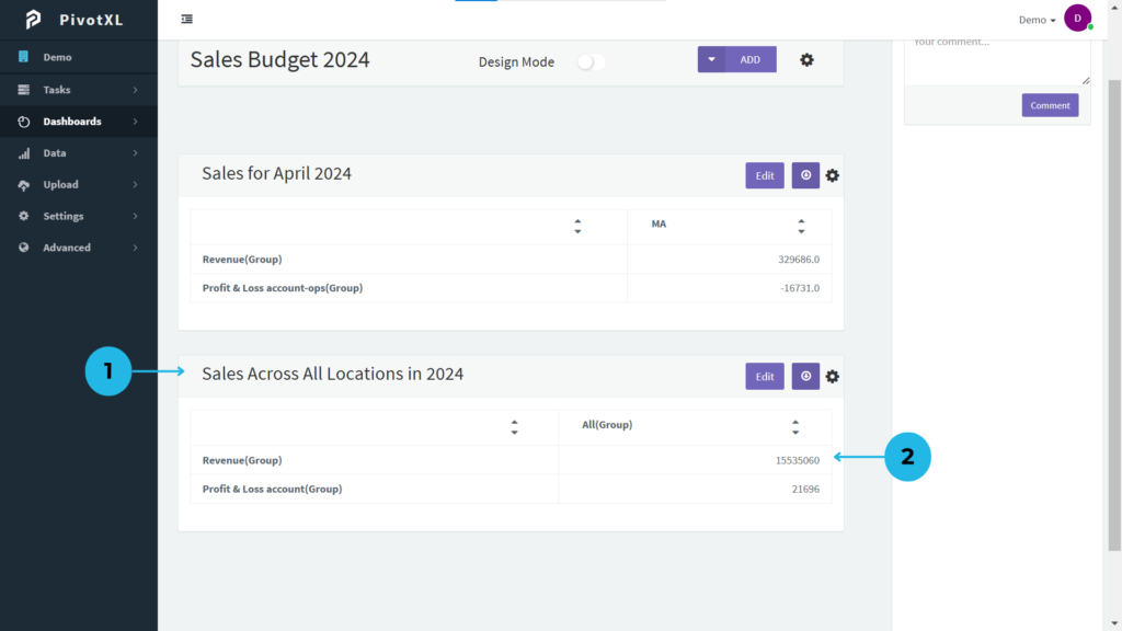
1.The PivotXL Dashboard presents a comprehensive table in the report section, offering a clear overview of your data.
2.The table presents two values tied to the account list. Click the first value to drill down and uncover deeper insights into the account details.
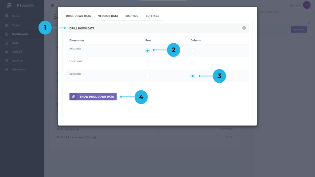
1.Clicking the account value opens a new pop-up for detailed drill-down analysis.
2.Choose the Accounts dimension for rows, generating a drill-down based on the selected row and column.
3.Choose the Scenario dimension for columns to dive deeper into the data by scenario.
4.Click “SHOW DRILL DOWN DATA” to explore more detailed insights within the selected accounts by scenario.
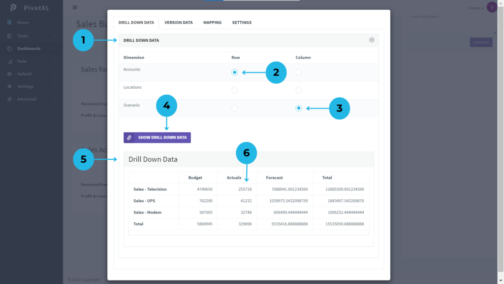
5.The drill-down data appears in the pop-up, grouped by Accounts in rows and Scenario in columns, displaying all related values.
6.Click on a specific value to delve further into the data from the base accounts.
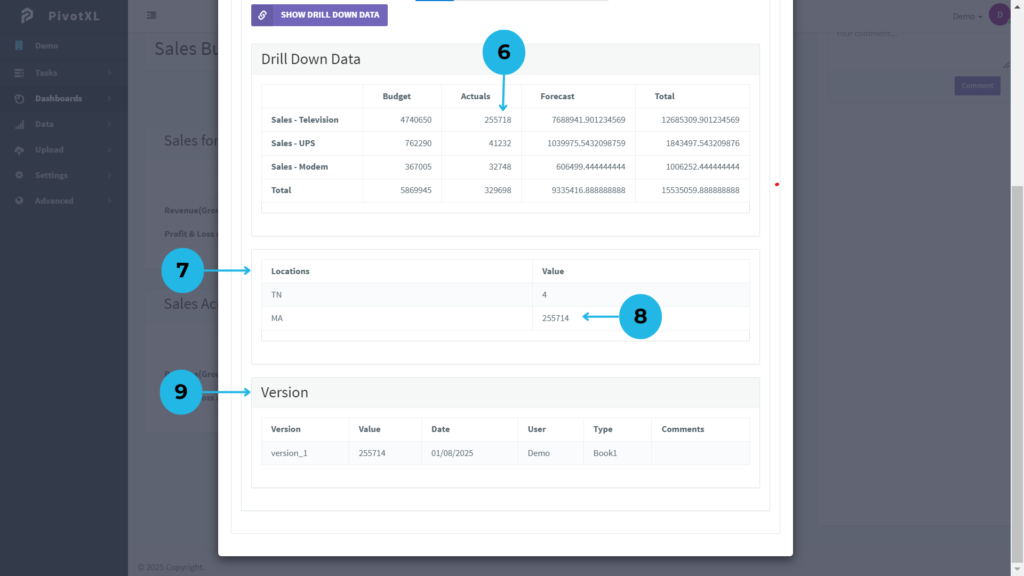
7.A new drill-down will appear, showing two values representing two members in the Location dimension.
8.View additional imported details at the end of the value by clicking the value.
9.A new tab displays version details, including the version name, value, upload date, file type, and comments.
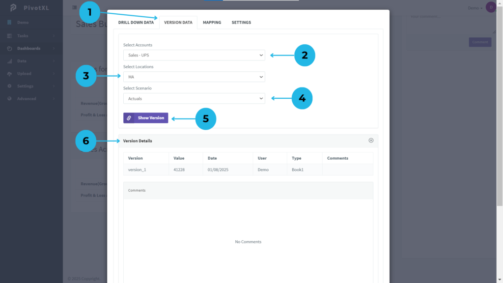
1.Click the Version Tab to view detailed version histories by selecting various dimensions.
2.Choose a specific Account member for version data insights.
3.Pick a Location member for more precise version details.
4.Choose a relevant Scenario member to refine the version data.
5.Click the “Show Version” button to view detailed version data for the selected dimension combination.
6.The results display a comprehensive list of versions, including the version name, value, upload date, file type, and reference comments.
7.View existing comments for the version data combination. Add your own comments for collaborative insights and better version tracking.
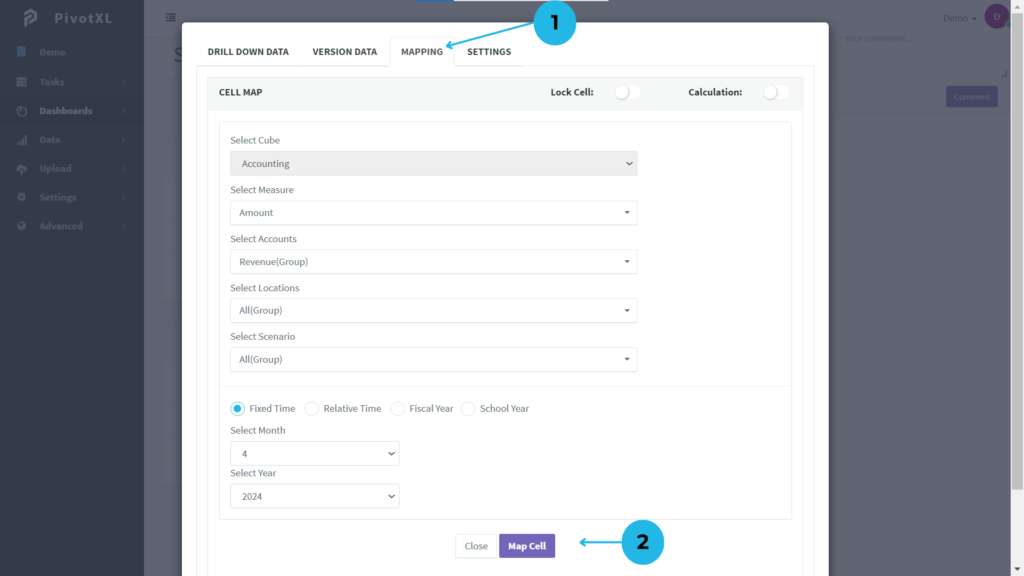
1.Click the MAPPING Tab to view detailed mapping information for table values.
- The Cell Map provides comprehensive details about the current mapping configuration.
- Cube Modifications are restricted but flexible remapping is available across all dimensions. Easily remap dimensions to update the mapping combination.
- Reset the month and year for accurate time-based mapping adjustments.
2.Once you’ve verified or updated the mapping, click Map Cell to confirm the changes. If no updates are needed, simply click Close to exit.
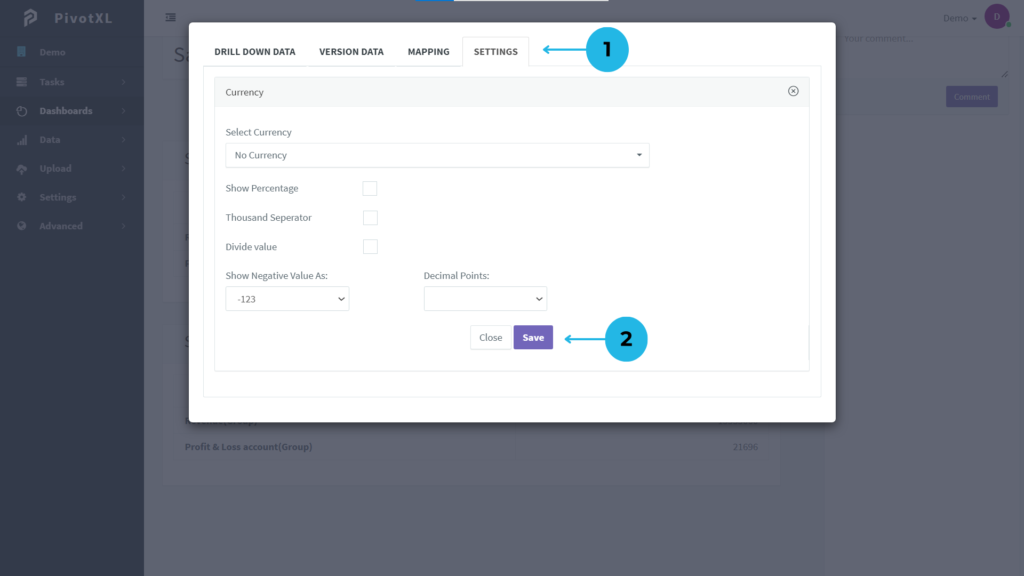
1.Convert table values to your local currency by selecting an option from the Select Currency dropdown.
- Mark the Show Percentage checkbox to display table values as percentages.
- Apply a thousand separator to improve readability.
- Use the Divide Value option to adjust table values accordingly.
- Choose how negative values are shown using the Select Negative Value dropdown.
- Select the number of decimal points from the dropdown for precise value formatting.
2.Click the Save button to apply and update your settings.