


Once data cubes are created and configured, their individual combinations can be seamlessly mapped to specific cells in Excel. Although Excel operates as an external application, the PivotXL add-in integrates directly with it, enabling a smooth interface between the two platforms.
As a user, understanding how the add-in functions will enhance your ability to effectively use the system. At its core, when a mapping is established, a connection is created between the external Excel file and the cloud application. This connection enables real-time interaction and data updates.
Each cell in Excel is linked to a unique combination from the data cube. For instance, cell A1 can be mapped to a specific cube combination that you’ve configured in the web application. This mapping ensures accurate and dynamic data representation in Excel, allowing you to leverage the full power of PivotXL for your reporting and analysis needs.
What You Will Learn in This Post
In this post, we’ll guide you through key features of PivotXL to enhance your efficiency and flexibility when working with Excel templates and data cubes. Here’s what you’ll learn:
- Mapping Individual Cells to the PivotXL Data Cube
Step-by-step instructions on how to link individual cells in your Excel sheet to specific combinations in the PivotXL data cube for precise data mapping. - Bulk Mapping to the PivotXL Data Cube
Learn how to efficiently map multiple cells or ranges in Excel to the PivotXL data cube at once, saving time and ensuring consistency across your templates. - Editing Rows and Columns in Excel
Understand how to safely edit rows and columns in Excel without disrupting the established links to the PivotXL database. This is crucial as any changes to the sheet’s structure can affect its connection to the database. - Creating Charts with PivotXL
Explore how to use PivotXL’s integration with Excel to create dynamic charts and graphs. Learn how to leverage Excel’s powerful charting tools while ensuring the data is fetched directly from PivotXL for real-time updates.
By the end of this post, you’ll have a solid understanding of how to maximize PivotXL’s features for seamless integration between your Excel templates and the data cube, ensuring accurate and automated reporting.
Cell Mapping – One to One Mapping
Cell Mapping (One-to-One Mapping) is a method where each individual cell in one data source is mapped directly to a single corresponding cell in another data source or destination. This mapping technique ensures precise alignment and transfer of data between two systems or datasets.
Advantages of One-to-One Mapping:
- Accuracy: Ensures precise alignment of data.
- Simplicity: Ideal for smaller datasets or fixed structures.
- Ease of Maintenance: Simple to troubleshoot and update.
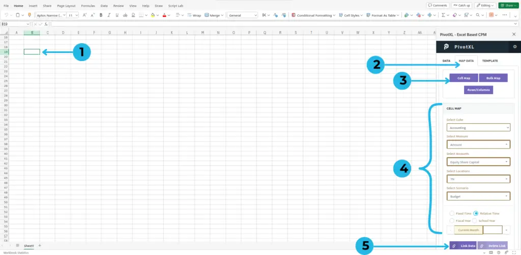
- Click on the cell you want to map.
- Select the “MAP DATA” tab, as shown in the picture.
- Click on the “Cell Map” button. It will display the cell map at the bottom of the plugin.
- Select the cube, dimension, dimension members, and measures you want to map.
- After selecting all properties of the cube, click on “Link Data.” You will see a toaster saying “Link created successfully.”
Using PivotXL for Efficient Cell Mapping (Tutorial Video)
Bulk Mapping
Bulk Mapping is a powerful feature that allows you to map an entire range of cells from a source dataset to a corresponding range in the target dataset in a single action. This method is especially useful when working with large datasets or repetitive mapping tasks, as it saves time and ensures consistency.
Advantages of Bulk Mapping
- Time-Saving:
- Significantly reduces manual effort for large datasets.
- Consistency:
- Ensures that all cells in the range are correctly aligned, minimizing errors.
- Scalability:
- Handles bulk data transfers efficiently, making it suitable for large or complex datasets.
You can map a range of cells using our bulk mapping feature.
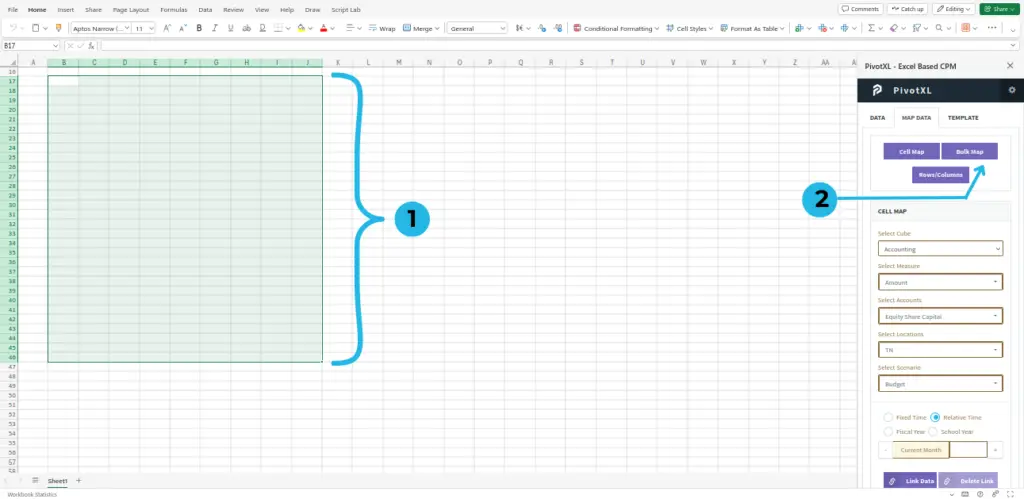
- Select the range of cells you want to map.
- Click on the “Bulk Map” button. A pop-up will open.
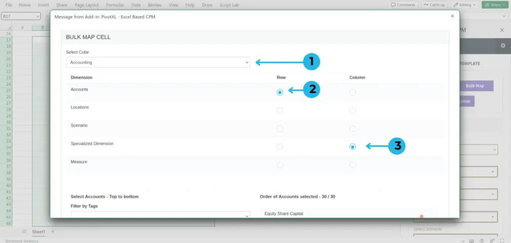
- Select the cube you want to map.
- Select the dimension for row.
- Select the dimension for columns.
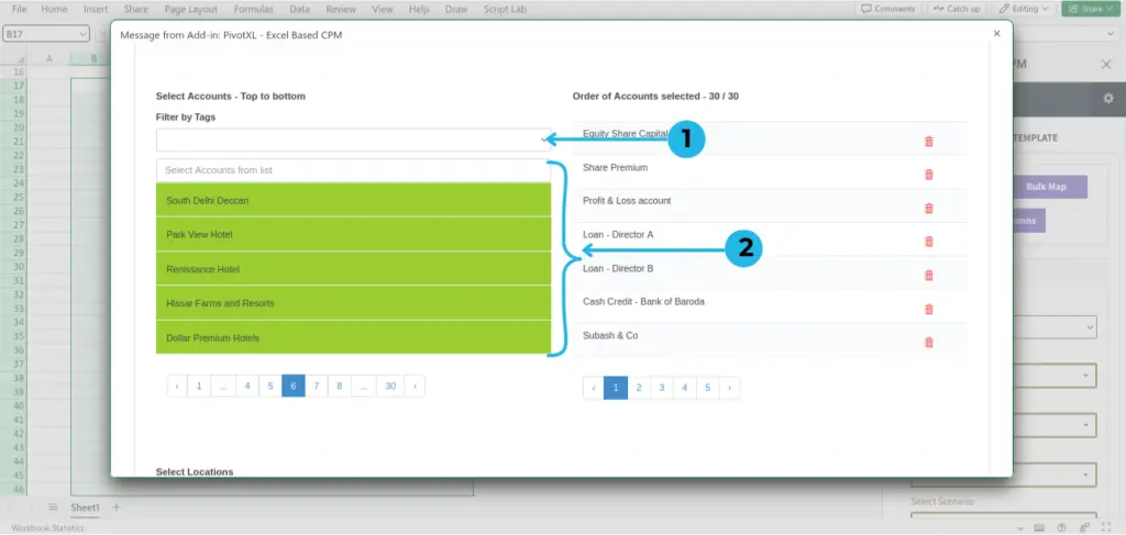
- Select ‘Filter by Tags’ from the drop-down.
- Select the order of rows you want to map. The order of the selected dimensions will be based on the clicking-wise sequence.
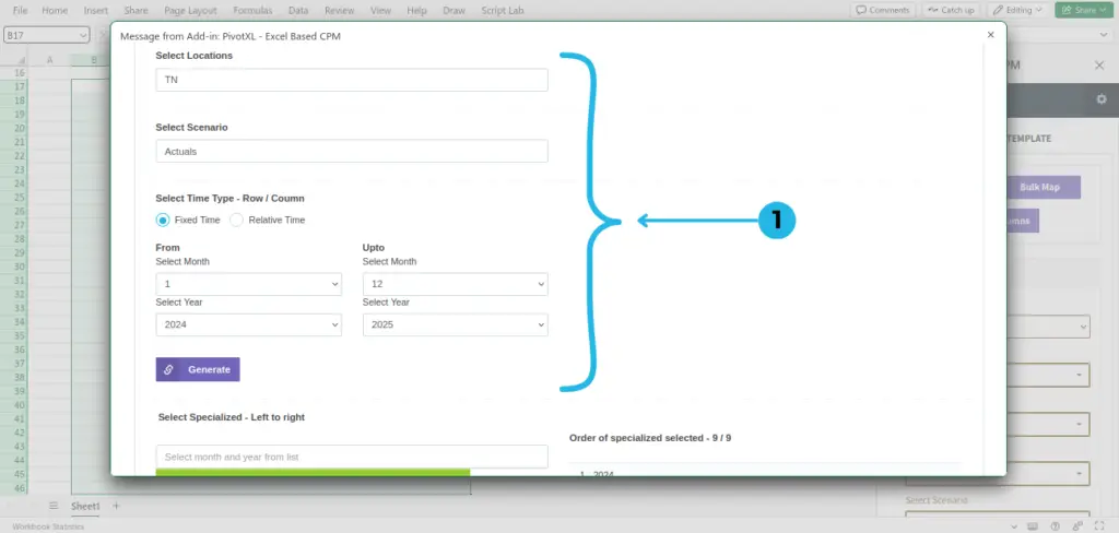
- Select all the required fields, such as Locations, Scenario, Time Type, and the rest of the dimensions for mapping.
Fixed Time: The Time dimension allows you to define fixed, specific time periods such as particular years, quarters, months, or even individual days. This feature is ideal for situations where exact time frames are required, such as historical trend analysis or bench marking across consistent intervals.
Relative Time: For more dynamic scenarios, you can leverage relative time periods that adjust automatically based on the current date. Examples include “last month,” “next quarter,” or “trailing 12 months.” This flexibility empowers users to conduct rolling analyses and maintain up-to-date insights without manual recalibration.
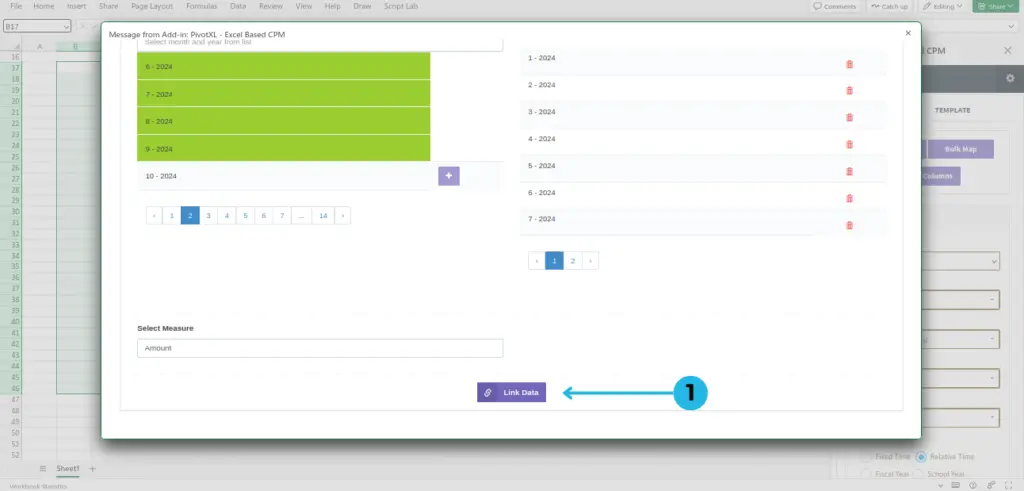
- Click on the ‘Link Data’ button to create the link. A toaster pop-up will say ‘Successfully mapped’.
Using PivotXL for Efficient Bulk Mapping (Tutorial Video)
Rows/Columns Adjustment Options
When working with data mapped using PivotXL, you should not use Excel’s built-in features to insert or delete rows and columns. Instead, use the PivotXL-specific options to ensure that all data links and mappings remain intact.
Here’s why and how you should use these features:
What Happens If You Use Excel’s Built-In Options?
If you insert or delete rows/columns using Excel’s default features, the mappings and links created using PivotXL may break. This could result in incorrect data being displayed or errors in your reports.
Why Use PivotXL’s Features?
- These options are specifically designed to work with mapped data from PivotXL.
- They ensure that every adjustment you make (inserting or deleting rows/columns) keeps the data links intact between Excel and the PivotXL web app.
How to Use PivotXL’s Options Instead?
- Add Column on Left + Update Links:
- Use this option to add a new column to the left of an existing column.
- It will automatically adjust all mappings and formulas to account for the new column.
- Example: Adding a new month in a financial report without breaking data links.
- Delete Column + Update Links:
- Use this option to delete an unwanted column.
- PivotXL will automatically update all mapped links and formulas to maintain accuracy.
- Example: Removing data for a specific month while ensuring the rest of the report remains correct.
- Add Row on Top + Update Links:
- Use this option to insert a new row at the top of your data.
- It ensures all formulas and mappings adjust accordingly.
- Example: Adding a new category or account to a profit and loss statement.
- Delete Row + Update Links:
- Use this option to delete a specific row.
- All mappings and formulas will be updated automatically to reflect the change.
- Example: Removing an outdated account or data category.
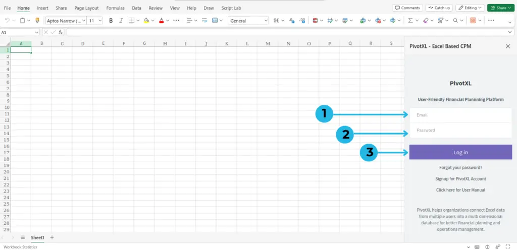
- Enter your Email: In the PivotXL login prompt, type your registered email address in the provided field.
- Enter your Password: Input the password associated with your account. Ensure it’s entered correctly to avoid login errors.
- Click on the “Log in” button: Once both fields are completed, click the Log in button to access the PivotXL Add-in and begin connecting your data.
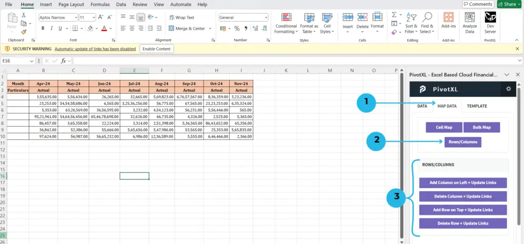
- Click on MAP DATA, and under that, you will see the Rows/Columns button.
- Click on the Rows/Columns button.
- Now you can view the options for rows and columns.
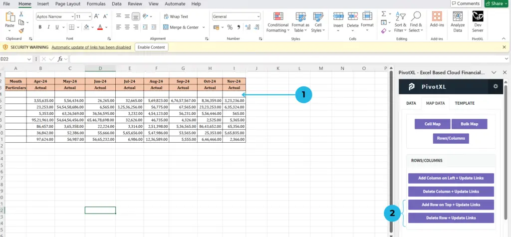
- Click on the row below where you want to add a new row on top.
- Click the Add Row on Top + Update Links button to add the row.
- To delete a row, click the Delete Row + Update Links button.
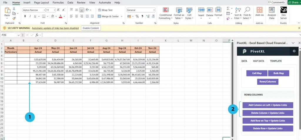
- Click on the column to the right where you want to add a new column on the left.
- Click the Add Column on Left + Update Links button to add the column.
- To delete a column, click the Delete Column + Update Links button.
Adjusting Rows and Columns in PivotXL (Video Tutorial)
Charting in Templates
With this setup, creating charts and graphs within templates becomes a straightforward process. Once the cells in Excel are mapped to the data cube, charts can be built directly within the template. When you use the Get Data feature to retrieve data from the database, the associated charts will automatically populate with the updated information.
Chart creation is primarily handled through Excel, leveraging all of its robust charting features. The data, however, is dynamically retrieved from the PivotXL database, ensuring accuracy and real-time updates. This seamless integration allows you to create visually compelling charts and graphs that update automatically whenever the underlying data is refreshed, streamlining your reporting and analysis workflows.