


📘 This post is part of the ebook: Excel for FP&A – Free E-Book
Read the full Table of Contents: Excel for FP&A – Free E-Book
⬅️ Previous Chapter: PivotTables for FP&A: Chapter 6
➡️ Next Chapter: Trial Balance Mapping in Excel for FP&A | Chapter 8
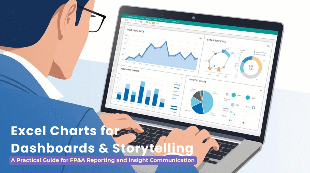
Excel Dashboard Charts play a critical role in FP&A by transforming raw financial data into clear, visual stories that executives can understand quickly. In modern financial reporting, Excel Dashboard Charts help analysts highlight trends, explain variances, and communicate insights with precision. Effective storytelling through data visualization ensures that FP&A teams deliver not just numbers, but meaningful interpretation that drives decision-making.
In FP&A dashboards, charts are not decorative elements. They are analytical tools that help stakeholders understand what is driving performance, where variances are occurring, and what actions may be required. This chapter explores how to design high-quality Excel charts that elevate FP&A reporting, improve interpretability, and support strategic conversations.
7.1 Why Excel Dashboard Charts Matter in FP&A
FP&A teams support business leaders who frequently have limited time and need fast clarity. Visuals enable faster understanding by focusing attention on patterns, exceptions, and directional changes.
Well-designed charts support FP&A by:
- Highlighting trends in revenue, margin, and expenses
- Visualizing Budget vs Actual variances
- Identifying risks and anomalies
- Simplifying complex financial models
- Improving stakeholder engagement in reviews
- Standardizing recurring dashboards and reporting packs
The goal is not to create “pretty charts” but to communicate insights with precision, clarity, and intention.
File: Ch07_KPI_Dashboard.xlsx
A KPI-focused dashboard template containing trend charts for Revenue, EBITDA, Gross Margin, and Headcount.
7.2 Principles of Effective Excel Data Visualization for FP&A
High-quality FP&A charts follow four key design principles:
1. Clarity Over Decoration
Remove unnecessary chartjunk—3D effects, gradients, cluttered data labels, and unrelated colors.
2. Consistent Color Coding
Use one color for Actuals, another for Budget, another for Forecast.
Executives rely on consistent patterns.
3. Highlight What Matters
Use contrast to emphasize variances, exceptions, or strategic KPIs.
4. Tell a Story
Every chart must answer one of FP&A’s core analytical questions:
- What happened?
- Why did it happen?
- What will happen next?
- What should we do?
If a chart does not answer a question, it does not belong in the dashboard.
7.3 Core Excel Dashboard Charts for Financial Reporting
Excel offers dozens of chart styles, but FP&A uses only a select set.
1. Line Charts — Best for Trends
Use for revenue, headcount, margin %, cash, and rolling metrics.
2. Column Charts — Best for Comparisons
Use for monthly expenses, category breakdowns, vendor spend.
3. Bar Charts — Best for Rankings
Use for department variance, top customers, top vendors.
4. Waterfall Charts — Best for Variance Analysis
Show how Actual differs from Budget or prior period.
Critical for FP&A storytelling.
5. Combo Charts — Best for Dual Measures
Examples:
- Revenue (columns) + Margin % (line)
- Volume + Price impact
6. Pie/Doughnut Charts — Use Sparingly
Only acceptable for very small categorical breakdowns, such as product mix.
File: Ch07_KPI_Dashboard.xlsx
A KPI-focused dashboard template containing trend charts for Revenue, EBITDA, Gross Margin, and Headcount.
File: Ch07_Waterfall_Variance.xlsx
A Budget vs Actual variance visualization file using a waterfall-style chart.
File: Ch07_Rolling12_Trend.xlsx
A rolling 12-month revenue trend dataset with visuals for time-series FP&A analysis.
7.4 Transforming Financial Metrics Into Visual FP&A Stories
Successful FP&A charts must pair analytics with storytelling:
Trend Storytelling with Excel Dashboard Charts
- What is trending up or down?
- Is the change seasonal, structural, or unexpected?
Variance Storytelling Using Excel Dashboard Visuals
- Where are deviations from Budget or Forecast occurring?
- What is the root cause?
- Are these controllable or uncontrollable factors?
Performance Storytelling in Excel Dashboard Reporting
- Are KPIs on track?
- Which business units are underperforming?
- What operational drivers explain the change?
Analysts should annotate charts where appropriate to highlight key insights.
File: Ch07_Waterfall_Variance.xlsx
A Budget vs Actual variance visualization file using a waterfall-style chart.
7.5 Using PivotCharts as Excel Dashboard Charts
PivotCharts automatically sync with PivotTables, enabling:
- Instant refresh during month-end
- Dynamic slicing by department, region, or version
- Rapid scenario comparison
- Multi-entity reporting
FP&A-friendly PivotChart capabilities include:
- Filtering by Version (Budget, Actual, Forecast)
- Using Timelines for Month/Quarter selection
- Embedding multiple PivotCharts into an integrated dashboard
Dashboards built this way update automatically when source data is replaced.
7.6 Designing Excel Dashboards for FP&A Reporting
A well-built dashboard contains:
1. Executive Summary KPIs
Revenue, Gross Margin, Opex, EBITDA, Cash Balance.
2. Key Trend Charts
Rolling 12-month trends for revenue and margin.
3. Variance Visuals
Budget vs Actual and Actual vs Forecast.
4. Department or Region Drilldowns
Interactive filters powered by slicers.
5. Clean Layout
Single screen view (no scrolling).
Consistent spacing, color palette, and typography.
Dashboard Layout Best Practices
- Place KPIs at the top
- Use left-to-right visual flow
- Group related charts together
- Use uniform chart sizes
- Keep labels concise
File: Ch07_KPI_Dashboard.xlsx
A KPI-focused dashboard template containing trend charts for Revenue, EBITDA, Gross Margin, and Headcount.
File: Ch07_Department_Dashboard.xlsx
A departmental dashboard template including expense summaries, category mix charts, and department trends.
7.7 Advanced Excel Dashboard Visualization Techniques
1. Rolling 12-Month Trends in Excel Dashboards
Use OFFSET or dynamic arrays to automate rolling windows.
2. Variance Waterfall Techniques in Excel Dashboard Charts
Break variance into components:
Price, Volume, Mix, Cost, FX, Headcount.
3. Scenario Comparison Visuals for Excel Dashboards
Actual vs Budget vs Forecast on a single visual.
4. Conditional Formatting in Excel Dashboard Charts
Highlight negative variances or threshold violations.
5. Custom Number Formats
Use professional presentation formats:
$#,##0Kfor thousands$#,##0,,for millions
File: Ch07_Waterfall_Variance.xlsx
A Budget vs Actual variance visualization file using a waterfall-style chart.
File: Ch07_Rolling12_Trend.xlsx
A rolling 12-month revenue trend dataset with visuals for time-series FP&A analysis.
7.8 Common Mistakes in Excel Dashboard Charts
Common errors include:
- Using too many colors
- Mixing Actual and Forecast using similar shades
- Adding 3D effects
- Overloading charts with data labels
- Using pie charts for complex comparisons
- Displaying raw GL accounts instead of aggregated views
Clean, consistent visuals build trust with stakeholders.
7.9 FP&A Exercises Using Excel Dashboard Charts
Template Files Used in This Chapter:
| Template Name | File Name | Purpose |
|---|---|---|
| KPI Dashboard Model | Ch07_KPI_Dashboard.xlsx | Executive KPIs + simple trend charts |
| Variance Waterfall Model | Ch07_Waterfall_Variance.xlsx | Budget vs Actual waterfall charts |
| Rolling 12-Month Trend Model | Ch07_Rolling12_Trend.xlsx | Rolling trend analysis |
| Department Dashboard Template | Ch07_Department_Dashboard.xlsx | Department-level dashboards |
(Mentioned but you did not yet ask me to generate these files—I can create them when ready.)
Exercise 1: Build a Revenue Trend Line Chart
Using Ch07_KPI_Dashboard.xlsx
Exercise 2: Create a Budget vs Actual Waterfall Chart
Using Ch07_Waterfall_Variance.xlsx
Exercise 3: Design a 12-Month Rolling Dashboard View
Using Ch07_Rolling12_Trend.xlsx
Exercise 4: Build a Department-Level Dashboard
Using Ch07_Department_Dashboard.xlsx
7.10 Summary: The Role of Excel Dashboard Charts in FP&A Reporting
Charts are a critical part of FP&A storytelling. They allow analysts to translate raw data into insights, support executive decision-making, and highlight the underlying narratives within financial performance. By mastering Excel charting techniques—particularly those used for variance analysis, trend insights, and KPI tracking—FP&A professionals can elevate the quality of reporting and strategic dialogue across the organization.