


Introduction
Bubble charts in Excel allow you to visualize three dimensions of data using X and Y coordinates along with bubble size to represent a third variable. They are useful for comparing multiple data points, such as sales performance, market trends, or business growth. In this guide, we’ll walk you through how to create bubble charts in Excel with step-by-step instructions and practical examples.
What is a Bubble Chart in Excel?
A bubble chart is a type of scatter plot that displays data points as bubbles instead of dots. What makes it unique is that it includes a third variable, which determines the size of each bubble. This allows you to compare three different data values at once, making it a powerful tool for visualizing trends, patterns, and relationships in your data.
When to Use Bubble Charts in Excel
Bubble charts are useful when you need to:
- Visualize the relationship between three numeric variables.
- Compare datasets in a more interactive and insightful way than a standard scatter plot.
- Analyze market trends, financial data, or business performance with clear visual impact.
How to Create a Bubble Chart in Excel
Follow the below instructions to create a bubble chart in Excel:
Prepare Your Data
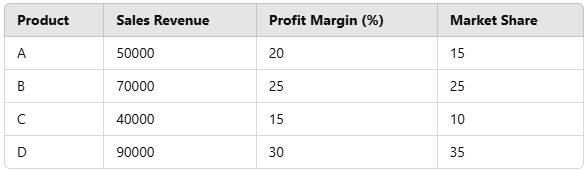
Before creating a bubble chart, ensure your data is structured correctly. Your dataset should include three
numerical columns:
- X-axis values (e.g., Sales revenue)
- Y-axis values (e.g., Profit margin)
- Bubble size (e.g., Market share)
Example dataset:
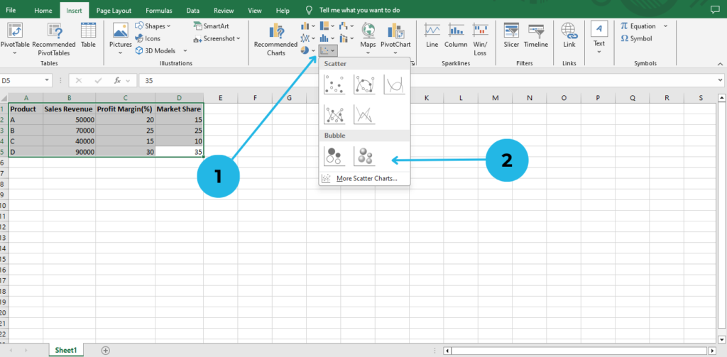
Insert a Bubble Chart
Once the chart is inserted, customize it for better readability and presentation:
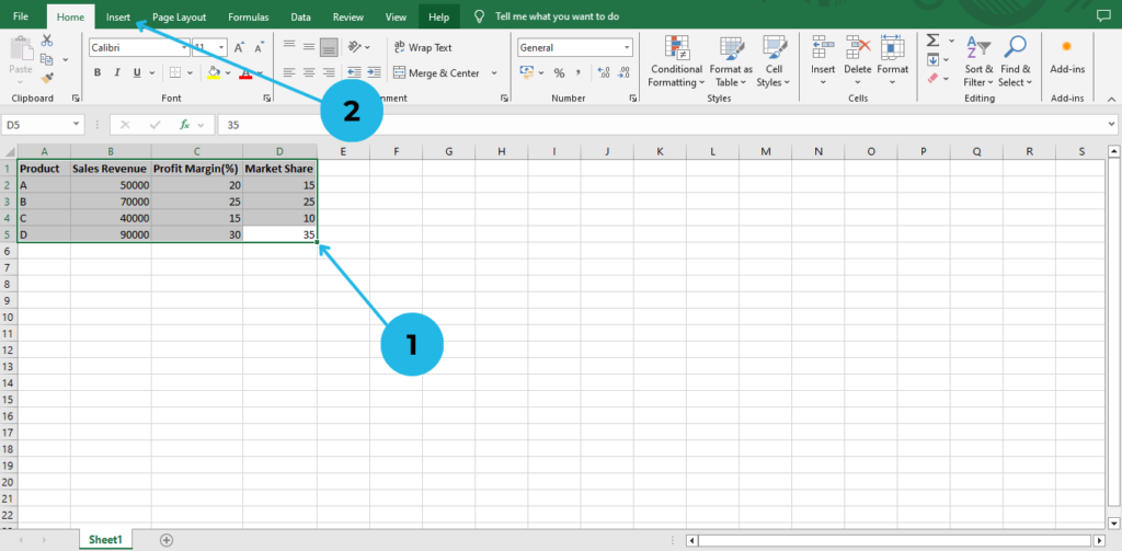
- Select the data range (excluding the column headers).
- Click on the Insert tab in the Excel ribbon.
- In the Charts section, click on Insert Scatter (X, Y) or Bubble Chart.
- Choose Bubble Chart from the options.
Customize the Bubble Chart
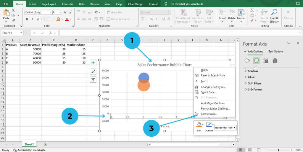
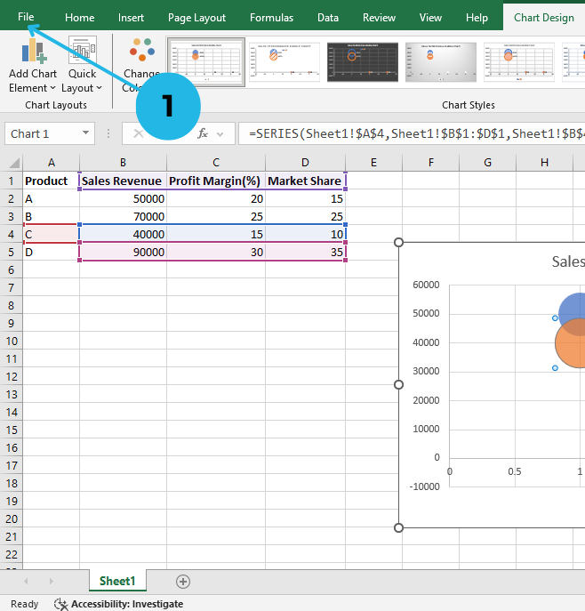
- Fix the Chart Title: Click on the title and rename it (e.g., “Sales Performance Bubble Chart”).
- Format the Axes: Right-click on the X and Y axes
- Choose Format Axis Adjust values for better readability.
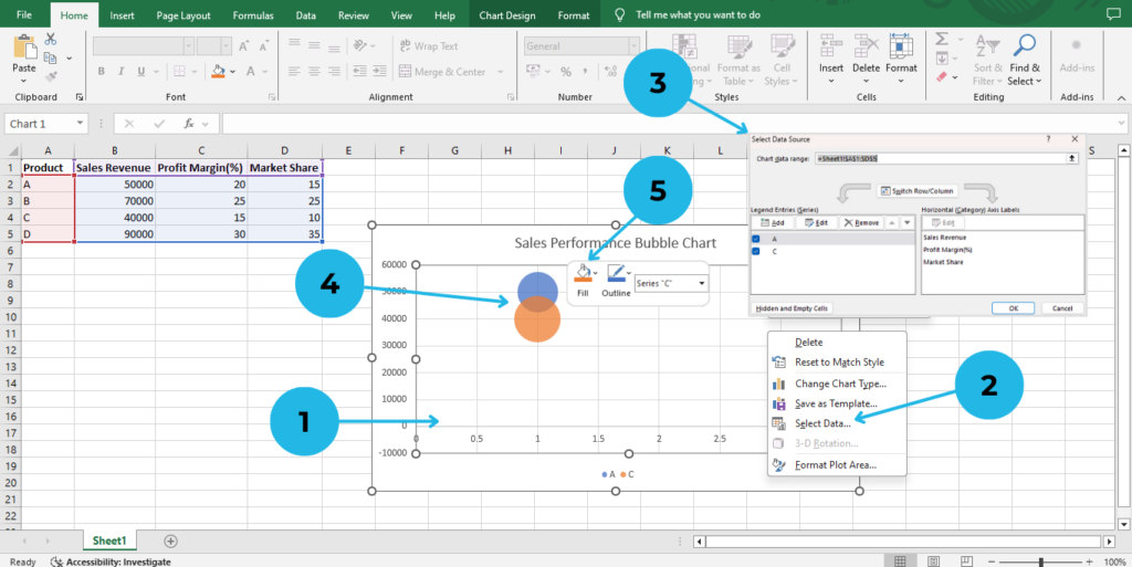
- Check Data Accuracy: Right-click the chart
- Choose Select Data and modify X, Y, and Bubble Size columns.
- Ensure the X, Y, and Bubble Size columns are correctly assigned in this table.
- Change Bubble Colors: Right click on a bubble.
- Choose the Fill option and select the color you want.
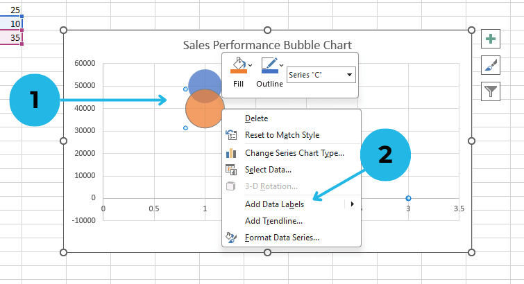
- Add Data Labels: Right click on a bubble.
- Choose Add Data Labels to add labels.
Save and Share Your Chart
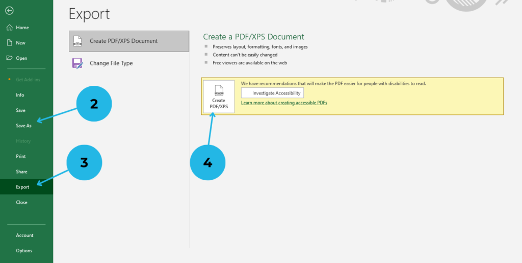
- Click on the File tab
- Select Save As to store your Excel workbook.
- To export the chart: Click on Export option
- Choose Create PDF/XPS option for use in reports and presentations.
Bubble charts are a powerful tool for visualizing relationships between three variables, making complex data easier to understand and compare. Bubble charts are useful when you need to visualize the relationship between three numeric variables. Moreover, they provide deeper insights compared to a standard scatter plot.
Conclusion
Bubble charts in Excel are an excellent tool for visualizing complex data in an easy-to-understand format. By following this step-by-step guide, you can create and customize bubble charts effectively for data analysis, business reports, and market research. Start experimenting with bubble charts in Excel today and unlock new insights from your data!
“For a more detailed understanding, check out our screenshots and examples included in this guide. Additionally, let us know in the comments if you have any questions or need further clarification. In the meantime, happy charting!”