


PivotXL’s PowerPoint Presentation (PPT) feature allows you to seamlessly convert financial analysis data reports into professional PowerPoint presentations. With this functionality, you can create high-level PowerPoint presentations for in-depth analysis and quick decision-making. The platform enables you to incorporate multiple tables and charts into your PowerPoint presentation based on your preferred template.
By leveraging tools like Tables and Pivot Tables, PivotXL simplifies the PowerPoint presentation creation process, ensuring a structured and efficient workflow. This feature securely processes your data, making it easy to generate insightful PowerPoint presentations directly from PivotXL.
Creating a Table for PowerPoint Presentation in PivotXL
What is a Table in PivotXL?
Tables in PivotXL help organize and present data clearly in PowerPoint presentation reports. They work like dashboard tables, ensuring consistency in reporting. Using tables makes it easier to analyze and interpret data.
With PivotXL, you can quickly create tables that improve clarity and professionalism in your presentations.
Steps to Create a Table for PowerPoint presentation in PivotXL
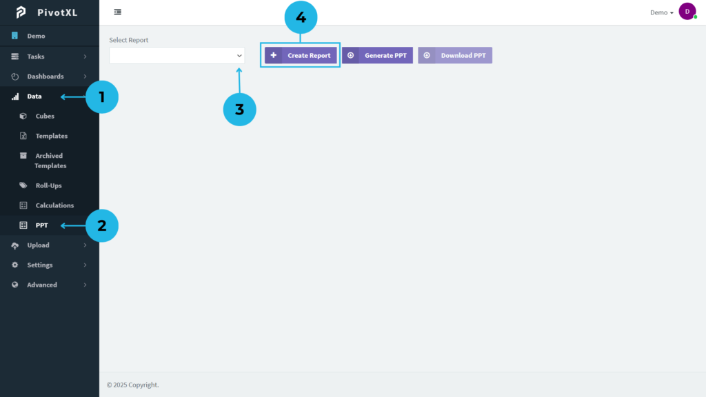
1. Login to PivotXL – Access the PivotXL application and navigate to the Data menu on the left sidebar.
2. Select PPT Report Option – In the Data menu, choose the PPT option to create a new PowerPoint report.
3. Reuse and Edit Existing Reports – By selecting an existing report, you can edit and update it according to your current needs.
4. Create a New Report – Click the button to generate a new report, customize the presentation, and organize your data efficiently.
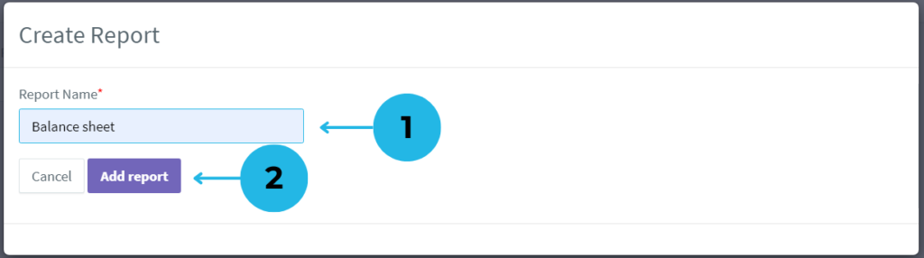
- A pop-up window appears for report creation. Enter a name in the Report Name field.
- Click the Add Report button to generate and save your new PowerPoint report in PivotXL.
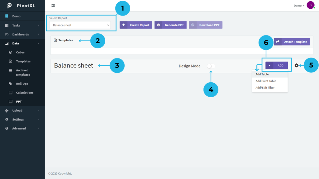
1. Updated Report in Dropdown – The newly created report appears in the Select Report dropdown list.
2. Add a Custom PPT Template – Use the Templates section to upload your custom PowerPoint template, ensuring the generated PPT matches your preferred design.
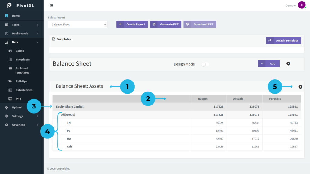
3. Report Overview & Options – The report displays its name along with key options: Design Mode, Add Button, and Settings Icon.
4. Modify or Delete Report – Click the Settings Icon to rename or delete the report as needed.
5.Use Design Mode for Edits – Enable Design Mode to make changes without affecting the live report. After completing your edits, disable Design Mode to see real-time updates instantly. This ensures your changes are applied accurately without disrupting the live report.
6. Add Table, Pivot Table, or Filter – Click the Add Button to insert a Table, Pivot Table, or Filter into your report. Select Add Table to include a structured table.
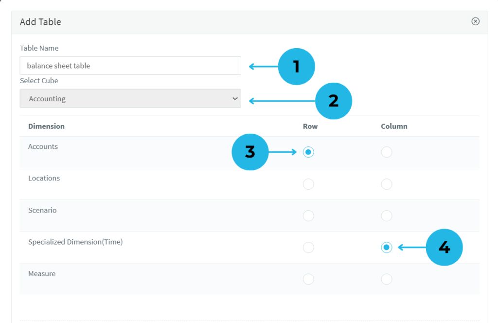
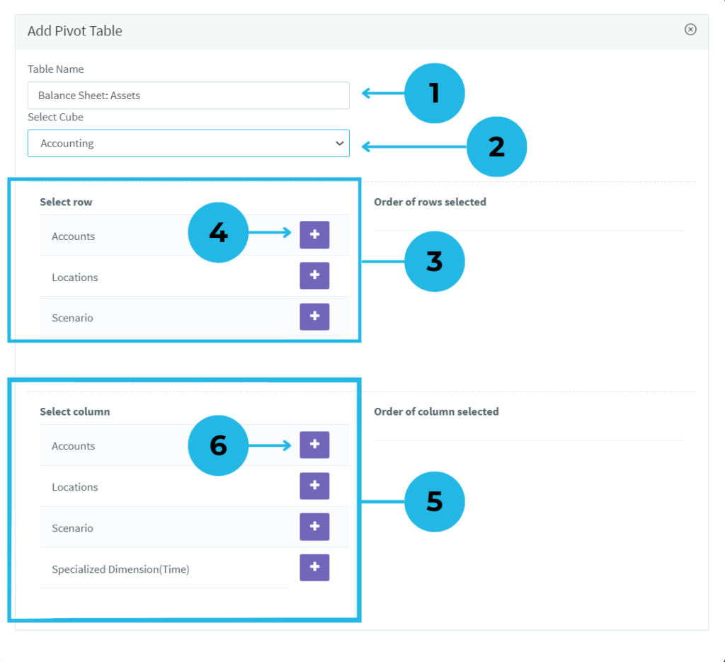
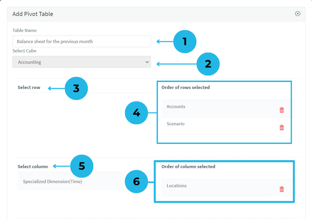
1. A pop-up window will appear for table creation. Fill in the Table Name field to start.
2. Choose the relevant cube, and the dimensions will be automatically fetched based on your selection.
3. Select the dimension to display in the row of your table for structured data.
4. Select the dimension to display in the column of your table for a comprehensive view.
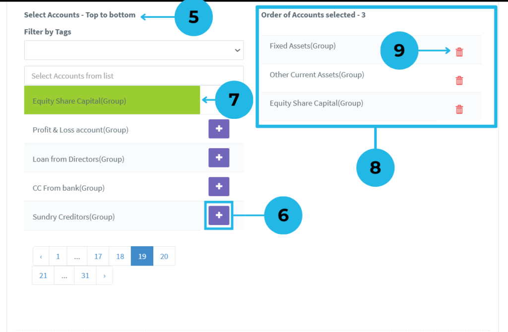
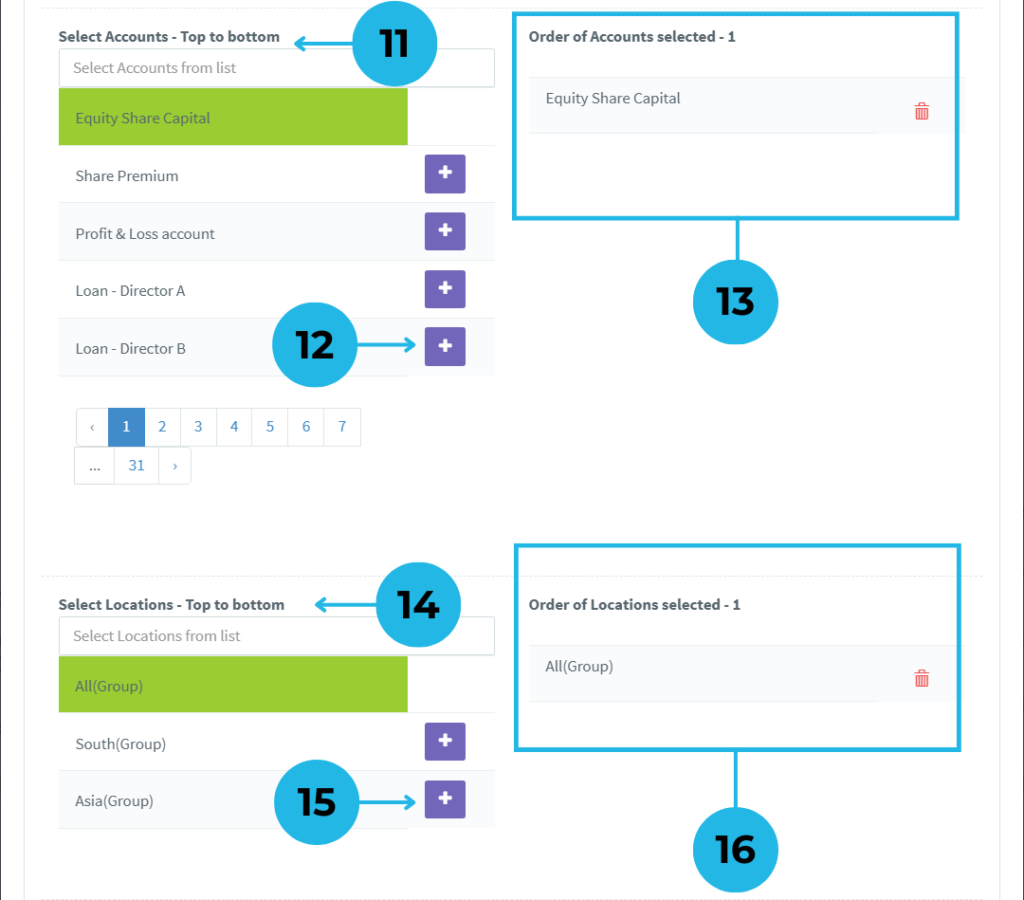
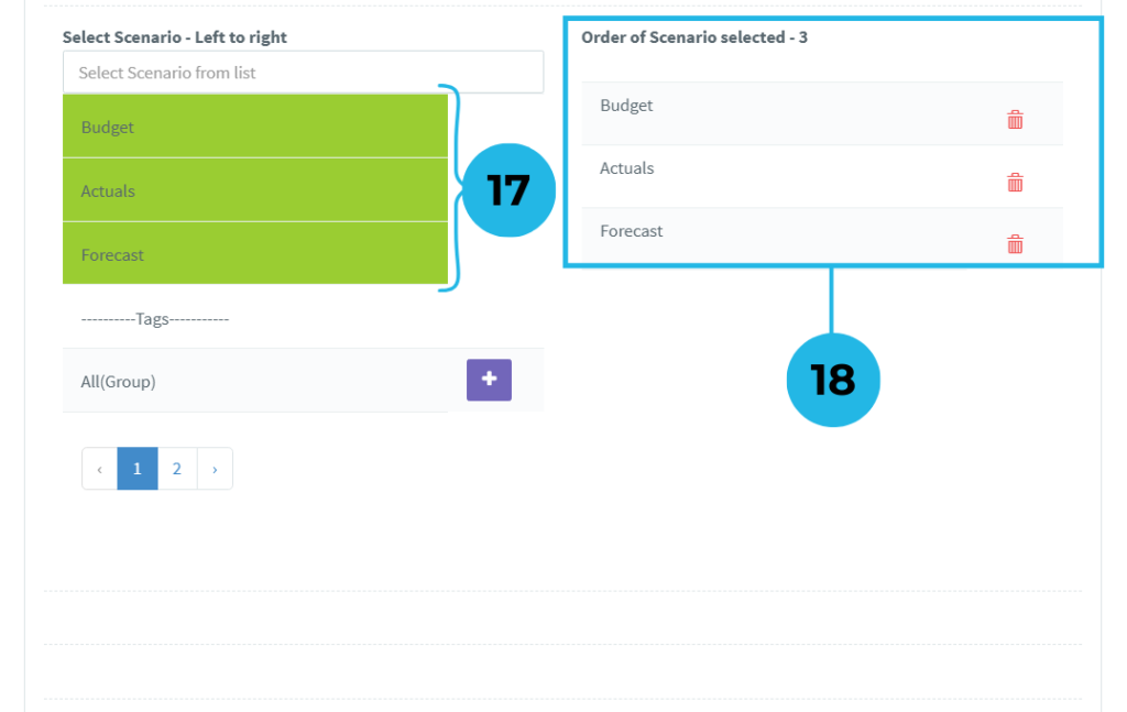
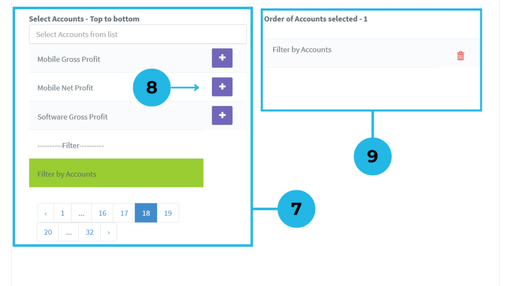
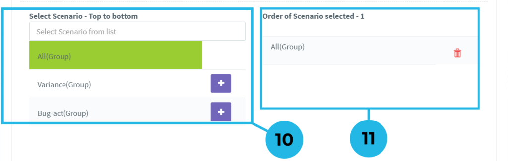
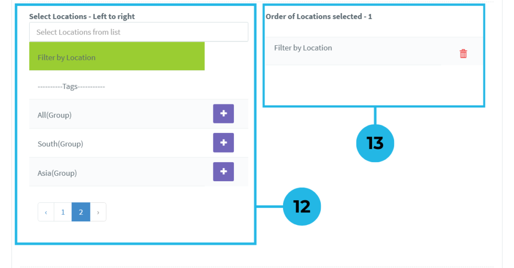
5. Choose specific dimension members or tags for the table’s row to focus on key data points.
6. Click the plus icon to add dimension members or tags to the row of the table.
7. A selected member turns green, providing visual confirmation of its successful inclusion in your table.
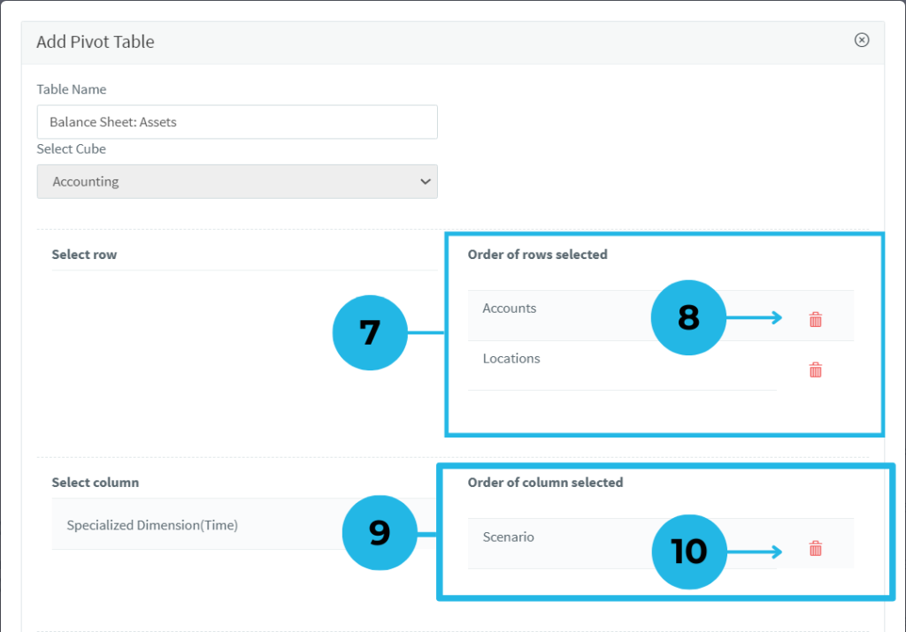
8. See the list of selected dimension members or tags for the table row, displayed with order and counts.
9.Easily edit the list of row members using the delete option to reorganize as needed.
10.Select a dimension member or tag to create a combined data report.
11.Select a dimension member or tag to create a combined data report.
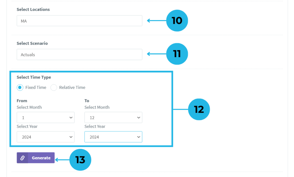
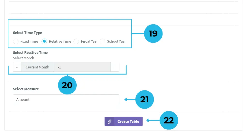
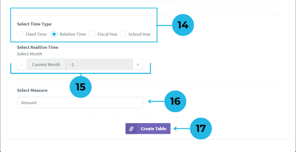
12. Selecting the right time type, month, and year ensures that your report reflects accurate, time-based data.
13. Click the Generate button to create columns, and select the corresponding month and year for the table.
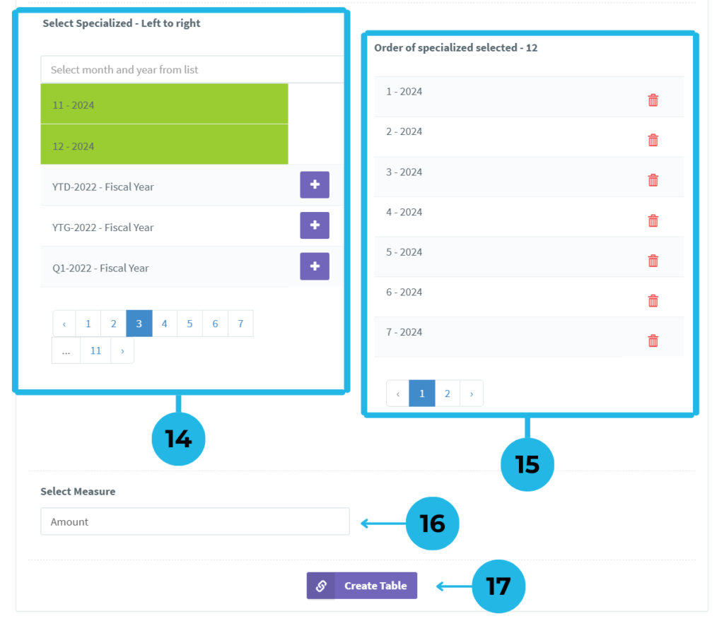
14. Select months and years from the list and click the plus icon to add them. Members will turn green upon selection, confirming they have been added.
15. You can modify the list by clicking the delete option.
16.Select a dimension member or tag to create a combined data report.
17. After reviewing the details, click Create Table to generate your report.
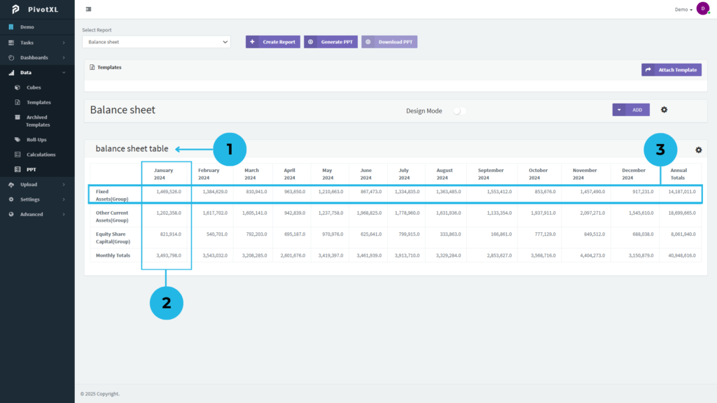
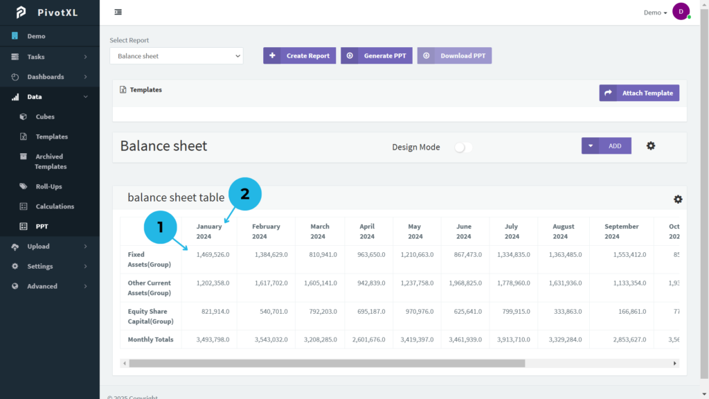
1.Table Created in the Report – The table is successfully generated and added to your report, ready for further customization.
2.Row List of Selected Dimension Members or Tags – This section displays the list of dimension members or tags selected for the rows in your table.
3.Column List of Selected Dimension Members or Tags – View the list of dimension members or tags selected for the columns in your table.
4.Modify Table Settings – Click the settings icon to adjust and customize the table settings according to your requirements.
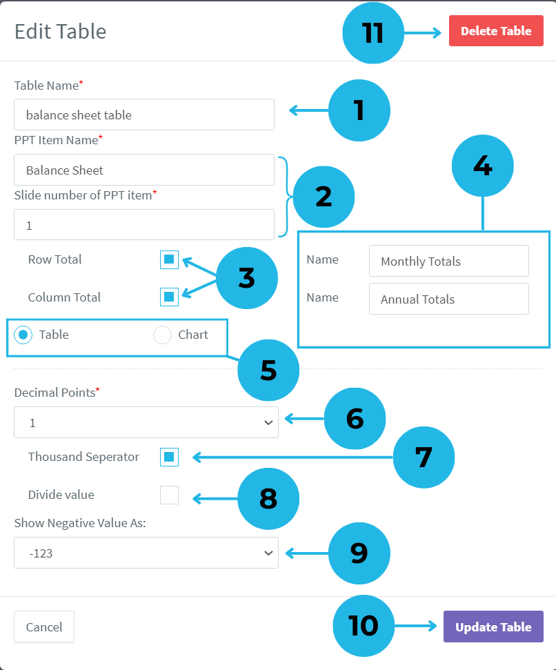
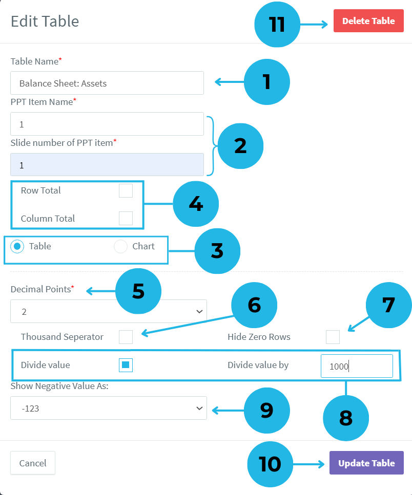
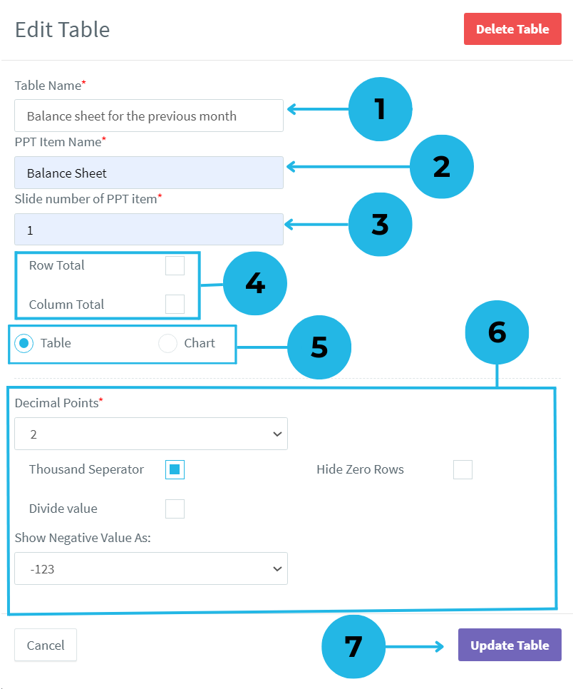
1.Modify the table name as needed to keep your report organized.
2.Ensure consistency by naming the PPT item and assigning the correct slide number.
3.Select checkboxes to automatically generate row, column, or both totals in your table.
4.Enter names for row and column totals in the generated name box to ensure clarity in reports.
5.Select ‘Table’ for a structured format or ‘Chart’ for graphical representation based on your PPT template.
6.Adjust the number of decimal places for table values using the dropdown menu.
7.Click the checkbox to format numbers with thousand separators for better clarity.
8.Enable this setting to divide table values by a custom number for better scaling.
9.Choose how negative values should appear using the dropdown selection.
10.Click Update Table to save all modifications instantly, or select Cancel to discard any changes.
11.Click Delete to remove the table if it is no longer required in your report.
1.Updated Table Display – The table now reflects all modified changes.
2.Row Total Added – A new row has been added, displaying the total values for all rows.
3.Column Total Added – A new column has been added, displaying the total values for all columns.
1. View Mapping Details – Click on a cell value to see its mapping details. You can modify the mapping under the cube dimension, but the cube itself cannot be changed.
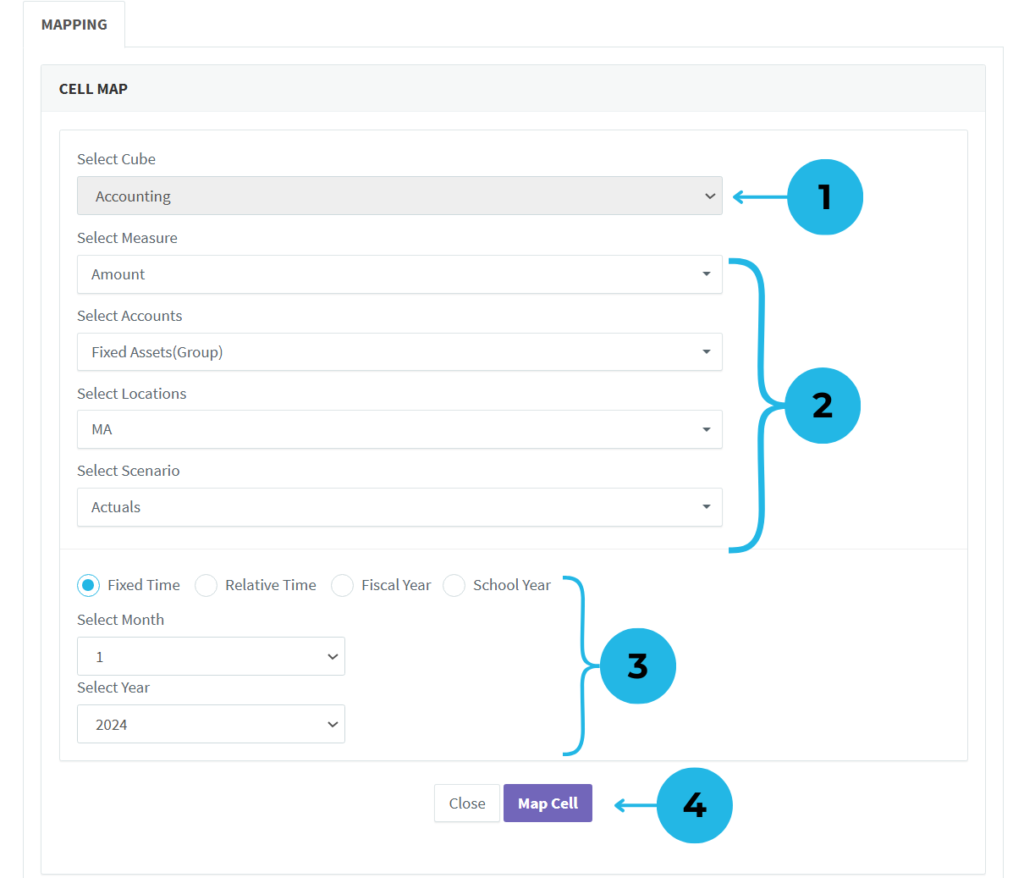
- The cube name is shown but cannot be edited.
- Change members in dimensions if needed to adjust the mapping.
- Modify the time settings for the mapping if required.
- Click the Map Cell button to apply the updates, or select Cancel if no changes are needed.
2. Edit Row or Column Headings – Click on any row or column name to edit the text and update it instantly.
Building a Pivot Table for PowerPoint Presentations in PivotXL
What is a Pivot Table in PivotXL?
Pivot tables in PivotXL allow you to efficiently summarize data by organizing it into structured categories. You can categorize data using dimension members or group them by tags, making it easier to analyze key insights. By leveraging pivot tables, you can create reports that highlight the most critical information while effectively visualizing large datasets.
With PivotXL’s PowerPoint integration, generating pivot tables for your presentations becomes seamless, helping you present complex data in a clear and professional format.
Why Use Pivot Tables in PivotXL for PowerPoint?
Pivot tables help transform raw data into meaningful insights, ensuring clarity and accuracy in presentations. Key benefits include:
- Efficient Data Summarization – Organizes large datasets into structured categories.
- Improved Data Visualization – Highlights key metrics for better decision-making.
- Seamless PowerPoint Integration – Ensures smooth data presentation in reports.
- Customizable Grouping – Enables dimension-based and tag-based categorization.
Steps to Build a Pivot Table for PowerPoint presentation in PivotXL :

1.Choose Pivot Table – Go to PivotXL, open the Data menu, select PPT, and click Add to insert a Pivot Table into your report.
- Create a Pivot Table – A pop-up window will appear. Enter a Table Name to begin.
- Select a Data Source – Choose the relevant cube, and its associated dimensions will be automatically retrieved.
- Define Row Dimensions – Choose two dimensions to structure the pivot table rows, ensuring an organized and detailed data presentation.
- Add Row Dimensions – Click the plus icon to add the selected two dimensions to the row section.
- Define Column Dimension – Choose one dimension to structure the pivot table column, ensuring a clear and organized data layout.
- Add Column Dimension – Click the plus icon to add the chosen dimension to the column section.
- View Selected Row Dimensions – Displays the list of chosen row dimensions in order.
- Modify Row Dimensions – Click the delete icon to reorder or remove a dimension. Note: For the second dimension, you can select a tag dimension member within the dimension for the pivot table.
- View Selected Column Dimension – Shows the chosen column dimension for the pivot table.
- Modify Column Dimension – Click the delete icon to remove or adjust the selected column dimension.
11.Select and add dimension members or tags to the row of the pivot table.
12.Click the plus icon to add a dimension member or tag. Once it is added, is it is will instantly turn green to confirm the selection.
13.View the list of selected members and tags in the first dimension. Modify the list using the delete option.
14.Only dimension tags (groups) can be added in the second row dimension.
15.Select a dimension tag to add to the row of the table. And then It will change green once successfully selected.
16.Review the list of selected tags in the second dimension and modify it using the delete option.
17.Choose dimension members or tags for the column of the table. Add them to the column to confirm selection.
18.View the list of selected dimension members or tags for the column. Modify the list using the delete option.
19.Select the relevant time type for your table report.
20.Choose the month and year based on the selected time type. Use the + icon for future months and the – icon for past months. The current month will be shown as 0.
21.Select a dimension member or tag to combine data for a detailed report.
22.Click the “Create Table” option to finalize and generate your pivot table.
1.Locate the Table Easily – The table is created within the report. To find it quickly, search by its name.
2.Customize Column Headings – The table displays multiple columns, and you can edit the column headings as needed. Simply click the text and modify it to your preference.
3.Edit Row Text – The first row is now displayed with the configured first-row dimension from the table setup. The row headings are fully editable—simply click any text to make the necessary changes.
4.Modify Tag Member Rows – The second row includes tag members, and just like the first row, you can edit the text by clicking on it.
5.Open Table Settings – Click the table settings icon to customize the table for easier analysis and a more structured view.
- Edit the pivot table name as needed to maintain an organized and clear report structure.
- Ensure consistency by naming the PPT item and assigning the correct slide number.
- Select ‘Table’ for a structured format or ‘Chart’ for a graphical representation based on your PPT template.
- Select checkboxes to automatically generate row, column, or both totals. Enabling the checkbox will show a text box for naming the totals.
- Use the dropdown menu to adjust the number of decimal places displayed for pivot table values.
- Click the checkbox to format numbers with thousand separators for better clarity and readability.
- Enable the ‘Hide Zero Row’ option to remove zero values from your pivot table, ensuring a cleaner report.
- Enable the setting to divide table values by a custom number for better scaling. (For example, if you divide 15,481 by 1,000, you will get 15.)
- Choose how negative values should appear in your table by selecting an option from the dropdown.
- Click “Update Table” to save all modifications instantly, or select “Cancel” to discard any changes made.
- Click “Delete” to remove the pivot table if it is no longer needed in your report.
Applying Filters to Tables for PowerPoint presentation in PivotXL
Filters in PivotXL help refine data, allowing you to focus on specific datasets for more precise analysis. By applying custom filters, you can highlight key insights, making your reports more targeted and meaningful. This feature enables you to organize data efficiently, ensuring that only relevant information appears in your PowerPoint presentation.
With PivotXL, you can utilize various dimensions to create dynamic filters that automatically update reports based on selected criteria. This ensures that your PPT reports remain accurate, up-to-date, and tailored to your analysis needs.
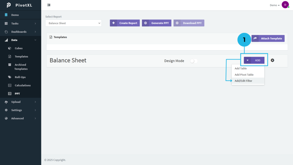
1. Choose Filter – Navigate to PivotXL, open the Data menu, select PPT, and click Add/Edit Filter to insert a filter into your report.
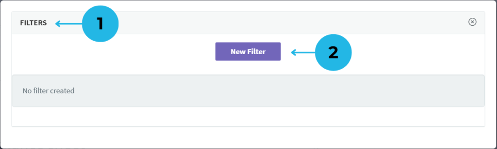
- Filter Management Window – A pop-up appears, displaying the list of existing filters along with editing options.
- Create a New Filter – Click the New Filter button to start configuring a new filter.
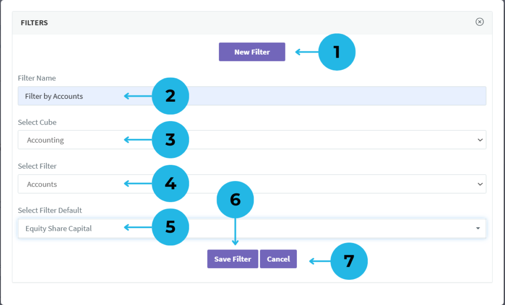
- Filter Configuration Settings – Once the new filter option is selected, a settings panel appears for customization.
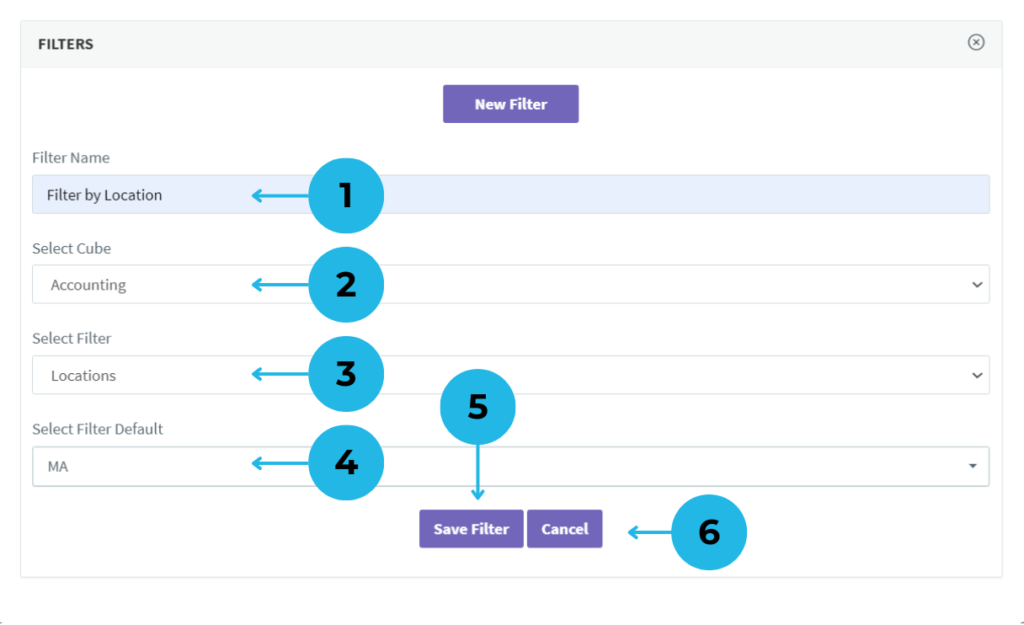
- Define Filter Name – Enter a meaningful name to easily identify your filter in the report.
- Select a Cube – Choose the relevant cube for your filter; dimensions linked to the cube will be automatically fetched.
- Choose a Dimension – Pick a dimension from the available list to refine your filter criteria.
- Set Default Filter Member or Tag – Select a default dimension member or tag to predefine filter behavior in the report.
- Save Your Filter – Click Save Filter to successfully add the new filter to your report.
- Cancel If Needed – If you do not want to proceed, click Cancel to discard the filter setup.
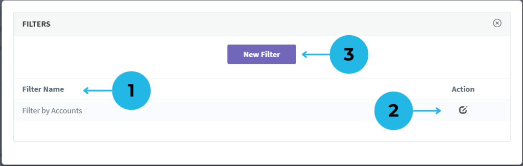
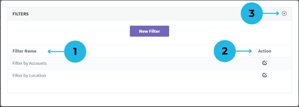
1. View Saved Filters – After saving, the created filter list appears in the same pop-up, displaying the filter name and edit options.
2. Modify Filter Settings – Click the Edit icon to update the filter name or change the default selection.
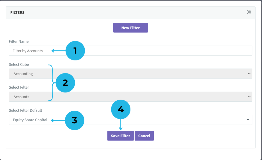
- The filter details are displayed, allowing modifications to the filter name if needed.
- The assigned cube and dimension cannot be changed once the filter is created.
- You can modify the default filter selection to suit your reporting needs.
- Click Save Filter to apply modifications, or use Cancel to discard changes and return.
3. Add a New Filter – Click the New Filter button to create an additional filter in this report. (Note: Use this button whenever you need to add new filters.)
- Define Filter Name – Enter a meaningful name to easily identify your filter in the report.
- Select a Cube – Choose the relevant cube for your filter; dimensions linked to the cube will be automatically fetched.
- Choose a Dimension – Pick a dimension from the available list to refine your filter criteria.
- Set Default Filter Member or Tag – Select a default dimension member or tag to predefine filter behavior in the report.
- Save Your Filter – Click Save Filter to successfully add the new filter to your report.
- Cancel If Needed – If you do not want to proceed, click Cancel to discard the filter setup.
- View Saved Filters – After saving, both newly created and existing filters appear in the same pop-up, displaying filter names and edit options.
- Modify Filters Easily – Use the Edit icon in the action section of the filter list to rename the filter or update the default selection.
- Return to PPT Report – Click the Close icon to exit the filter settings and navigate back to the PPT report page.
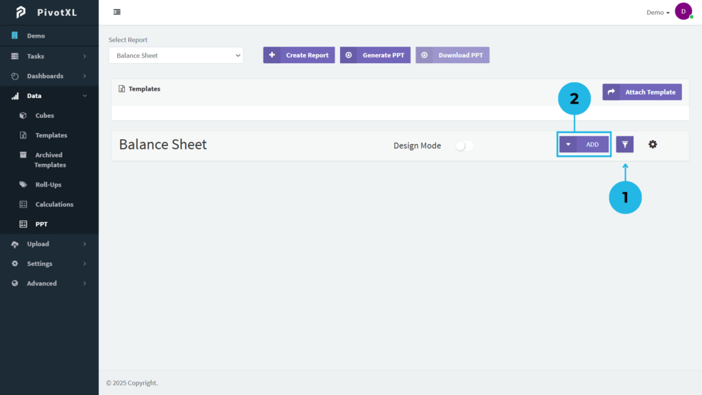
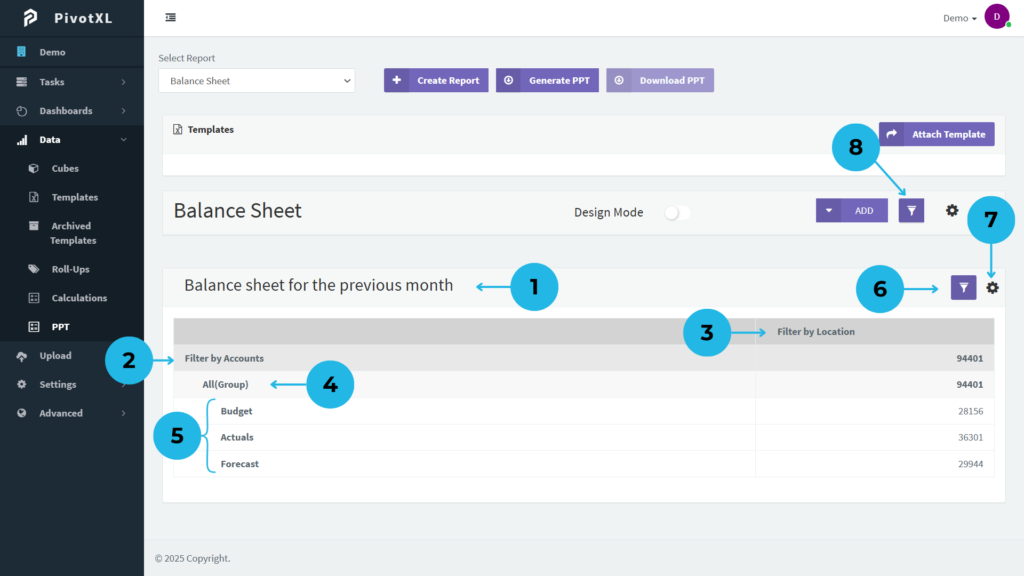
1.Manage Report Filters – Filter has been added to this report. Click the Filter icon to open filter management settings and make adjustments as needed.
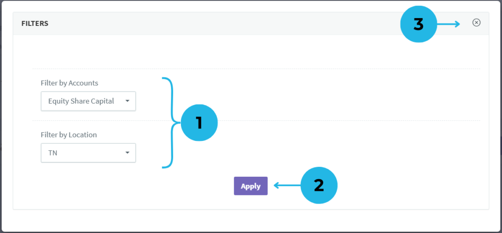
- Filter Management – A pop-up appears, displaying available filters and their assigned default dimension members or tags. Modify the dimension member or tag in the dimension filter as needed for your report.
- Apply Filter Changes – After making modifications, click the Apply button to update the filters in your report.
- Exit Filter Management – Click the Close icon to exit the filter management screen without making changes.
2. Apply Filters to Tables – Click the Add button to create a Table or Pivot Table with the applied filters in this PPT report.
1.Enter a Table Name to begin.
2.Choose the relevant cube, and its associated dimensions will be automatically retrieved.
3.To properly configure the pivot table, first choose two row dimensions. Keep in mind that while the first allows members or tags, the second needs to be a tag. Once selected, click the plus icon to add them.
4.View selected row dimensions. Click the delete icon to reorder or remove them.
5.Click the plus icon to add a dimension to the column section.
6.View or remove the selected column dimension as needed.
7.Displays the list of dimension members and tags for the first row dimension. Any existing filters applied in the report will appear under the dimension.
8.Click the plus icon to add dimension members or tags to the table row. If using filters, they will be listed under the dimension heading. Click the plus icon next to the selected filter name to apply it to the row.
9.View the list of selected members, tags, and filters for the first row dimension. Use the delete option to modify the selection.
10.Only dimension tags (groups) can be added to the second row dimension. To add a tag, click the plus icon, and it will change to green.
11.Check the selected tags in the second row dimension and use the delete option to update them.
12.Only dimension tags (groups) can be added. Click on a tag to select it, and it will appear in green.
13.Check the selected tags in the second row dimension and use the delete option to update them.
14.Select the relevant time type for your table report.
15.Choose the month and year based on the selected time type. Use the + icon for future months and the – icon for past months. The current month will be shown as 0.
16.Select a dimension member or tag to combine data for a detailed report.
17.Click the “Create Table” option to finalize and generate your pivot table.
1.View Created Pivot Table – Displays the generated pivot table with applied filters.
2.Accounts Dimension Filter – The first row represents the Accounts dimension filter used in the pivot table. Click any text in the table to rename it. Keep in mind that only text labels can be modified; numerical values and calculated fields remain unchanged.
3.Location Filter – The table features a Location Filter, allowing you to segment data by region effortlessly.
4.Scenario Dimension Tag – The second row of the table applies a dimension tag from the Scenario dimension for structured data grouping.
5.Included Dimension Members – Displays the dimension members grouped under the second-row dimension tag. Shows individual data categories like Budget, Actuals, and Forecast, which are included in the Accounts filter.
6.Filter Details – Click the filter icon in the table to view the applied filters in the pivot table.
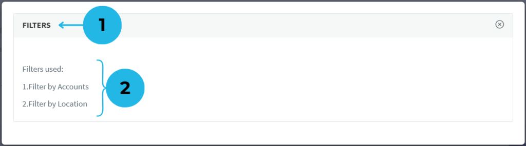
- A new pop-up opens, displaying detailed information about the filters applied to the table.
- Shows the list of filters used in the table, sourced from the PPT report filters for enhanced data control.
7.Advanced Table Tools – Click the settings icon to access advanced tools for enhanced table analysis.
8.Manage PPT Report Filters – Click the PPT report filter icon to view or modify report filter details.
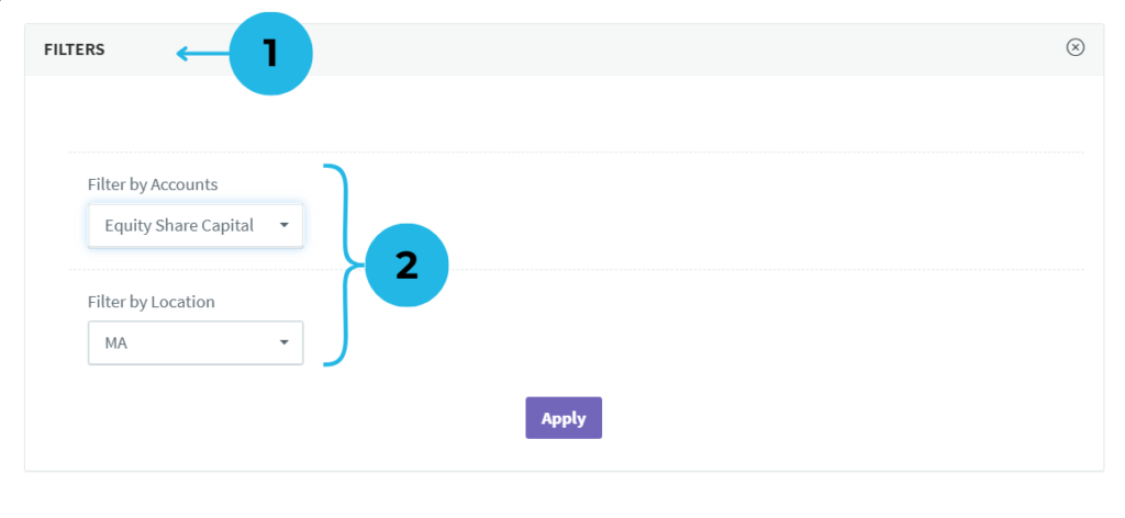
- A dedicated pop-up window opens, allowing users to manage report filters efficiently.
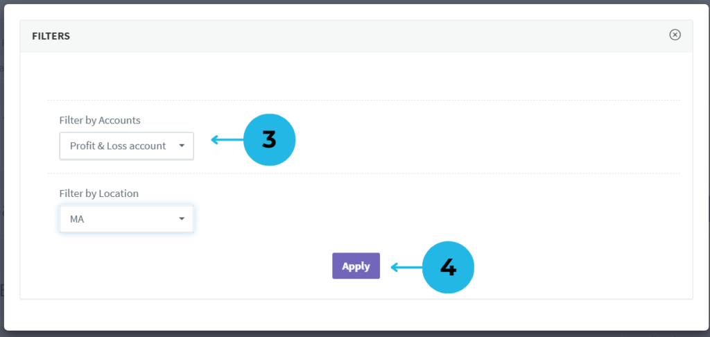
- Displays the list of applied filters, including the current dimension filter member.
- Click the dropdown to view and select from available dimension members or tags. For example, change Equity Share Capital to Profit & Loss Account.
- Click the Apply button to update the modified filters in the PPT report.
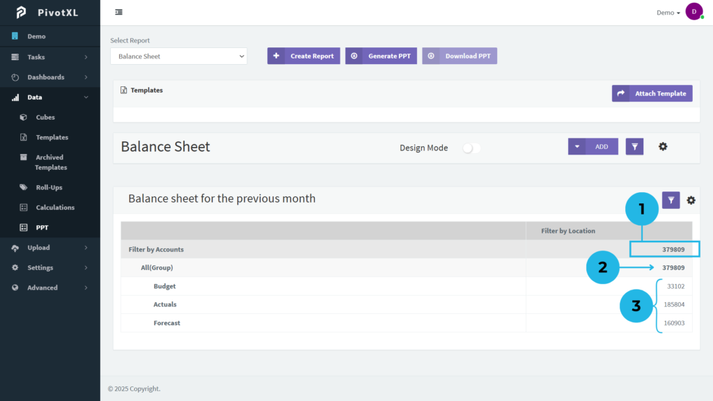
1. Updated Dimension Filter Member
- The “Filter by Accounts” setting now uses a new dimension filter member, replacing the previous one. This ensures the pivot table updates automatically, keeping data accurate and relevant.
2. Reorganized Tags in All (Group)
- Tags in the All (Group) category are now structured based on the updated dimension filter. This enhances organization and improves data clarity.
3. Listed Members Under the Tag
- The dimension tag now displays members adjusted by the new filter, making it easier to track relevant data.
Prepare Your PowerPoint Presentation Template
Setting up your PowerPoint (PPT) template for a PivotXL report ensures seamless data integration and professional presentation formatting. Follow these steps to prepare your PPT for accurate report generation:
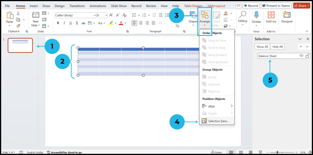
1.Prepare Your PPT Template – Prepare Your PPT Template – Open your PowerPoint template and add the required slides for your report.
2.Use the Table Format – This template follows a table-based structure. Therefore, confirm that your slides align with the required format in your PPT file.
3.Access the Selection Panel – In your PPT file, go to the Home tab and click on the Arrange option. As a result, a list of options will appear.
4.Open the Selection Panel – From the list, select Selection Panel to open a new panel on the right side of the screen. This allows you to manage slide elements efficiently.
5.Define the Selection Name – Assign a name in the Selection Panel and copy it. Most importantly, ensure that this name matches the table setting in your PivotXL PPT report for seamless integration.
Generating and Downloading a PowerPoint Presentation in PivotXL
Effortless PowerPoint Report Generation
PivotXL streamlines the process of creating professional PowerPoint reports directly from your data. With just one step, you can convert tables and pivot tables into a structured PPT presentation, ensuring a seamless workflow. After generating your report in PivotXL, complete the process and download your PowerPoint file with a single click.
This feature enhances efficiency by allowing you to quickly transform data into well-organized presentations, making it easier to share insights and drive informed decision-making.
Steps to Generate a PowerPoint Presentation in PivotXL
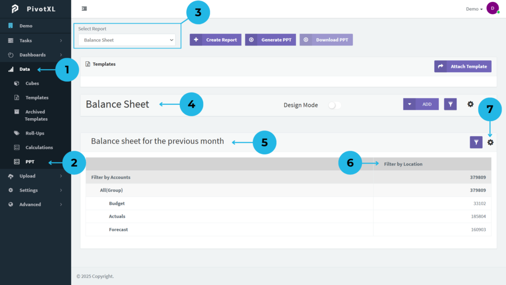
1.Open PivotXL – Navigate to the Data menu on the left sidebar.
2.Select PPT Option – In the Data menu, choose the PPT option to generate a PowerPoint presentation from the PivotXL report.
3.Choose a Report – The Select Report dropdown lists available reports. Pick one to proceed.
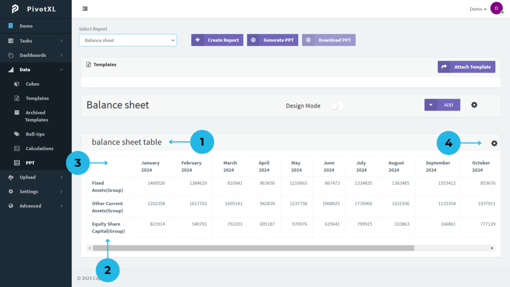
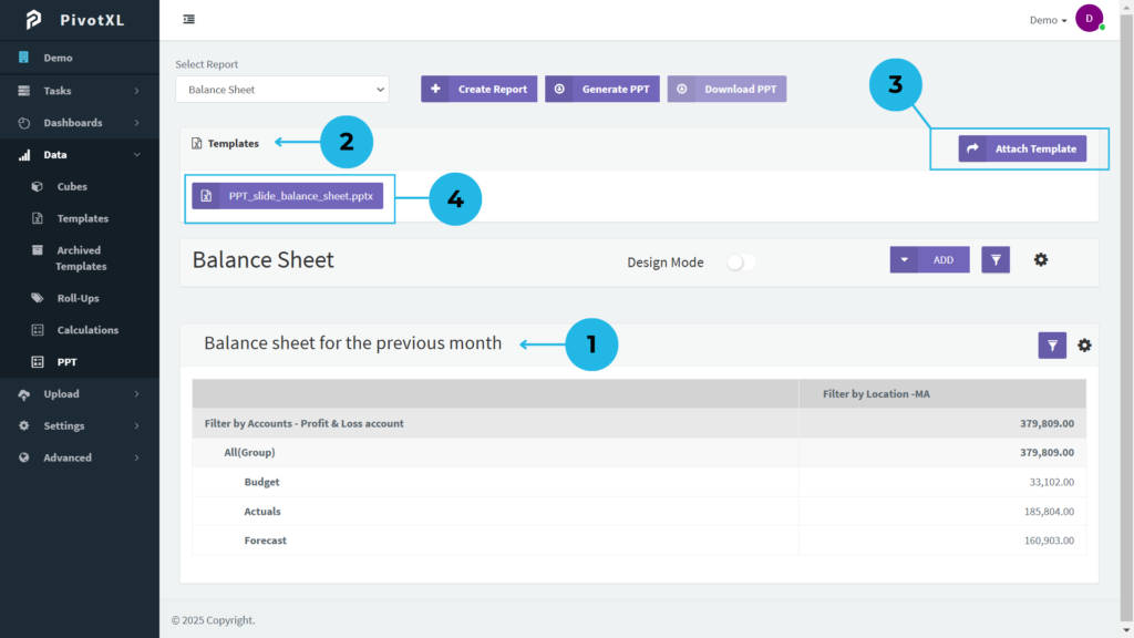
4.View Report Details – After selecting a report, its details and tables will appear.
5.Pivot Table Display – In this report, the Balance Sheet Pivot Table appears.
6.Edit Table Headings – Row and column headings are editable. Click on the text to modify it as needed.
7.Add a Table to Your PPT – To configure and add a table:
- Click the Settings icon.
- Open Table Settings and adjust as needed.
- Add the table to your PPT report with a simple setup.
- If needed, update the table name to match your requirements.
- Set the PPT Item Name – The PPT Item Name field must match the PPT Selection Panel Name. This is mandatory for generating the PPT.
- Specify Slide Numbers – Enter the number of slides in the Slide Number field based on your PPT template. To maintain consistency, if your PPT template contains just one slide, be sure to specify “1” as the Slide Number in the table settings.
- Enable Automatic Totals – If needed, select checkboxes to generate row, column, or both totals. Enabling a checkbox will display a text box where you can name the totals.
- Choose Table or Chart Format – Select ‘Table’ for a structured format or ‘Chart’ for a graphical representation.
1.Table Updates with PPT Setup – The table is updated based on the selected PPT setup.
2.Use the Templates Section – This section lets you add your preferred template for generating a PPT report.
3.Add a Template – Click the button to add a template for your PPT. A pop-up will open, allowing you to select and upload your template.
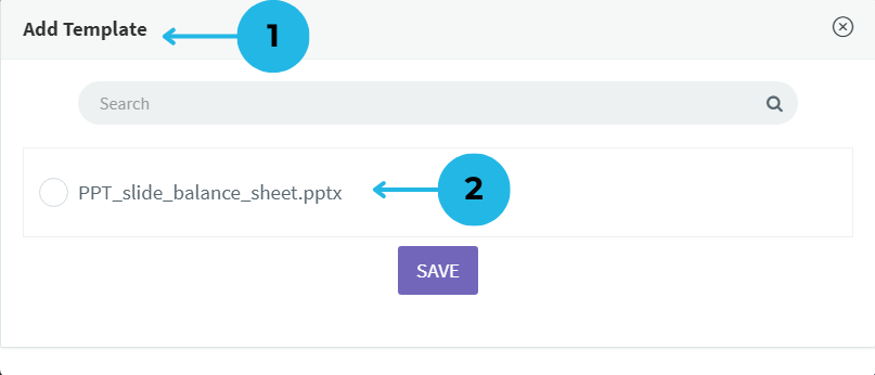
- A new pop-up appears, showing available templates from your PivotXL Templates. Select one to include in your PPT report.
- The pop-up lists template files by name, each with a checkbox for selection.
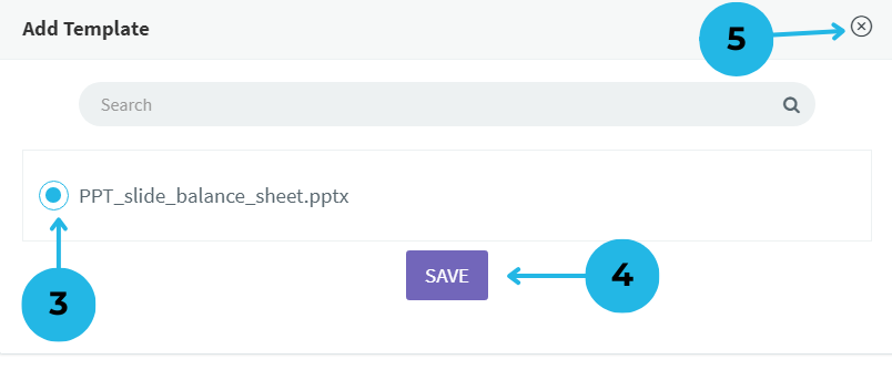
- Mark the checkbox next to the template you want to add.
- Click the SAVE button to apply the selected template to your PPT report.
- Click the close icon if you want to exit the pop-up without making changes.
4.Save and Verify – Once saved, the selected template appears in the Templates section. Before generating the PPT report, double-check the template name for accuracy.
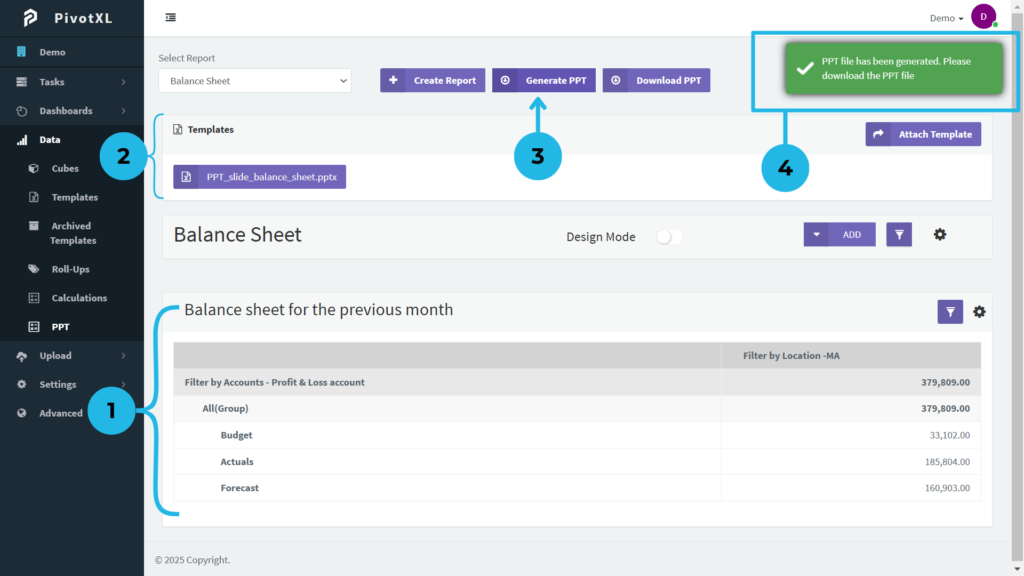
1.Review Your Tables – Before generating your PPT, check each table for accuracy, completeness, and proper formatting. For example, make sure the data is correct and well-organized. This ensures a professional and error-free presentation. As a result, your final PPT will look clear and polished.
2.Verify the Template – The attached template appears in the Templates section. Confirm that the correct one is selected.
3.Generate the PPT – Click the “Generate PPT” button to start converting your report into a PPT file.
4.Success Notification – Within seconds, a success notification appears in the top right corner, confirming the PPT is ready for download.
Steps to Download a PowerPoint Presentation in PivotXL
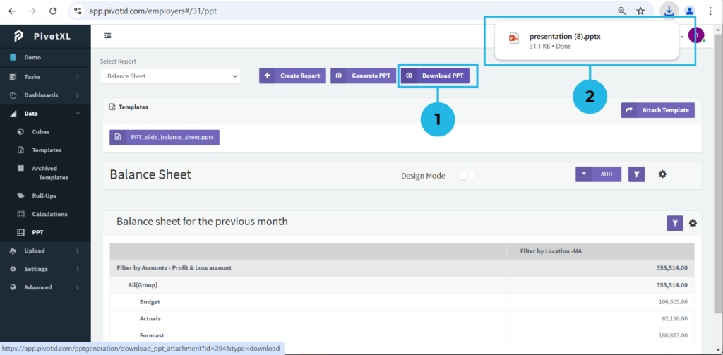
1.Download the PPT – Click the “Download PPT” button to save the generated file.
2.Access the Downloaded File – Once the download is complete, find the PPT file at the top of your downloads list. Then, click to open it and verify that your report displays correctly with the selected template and data.
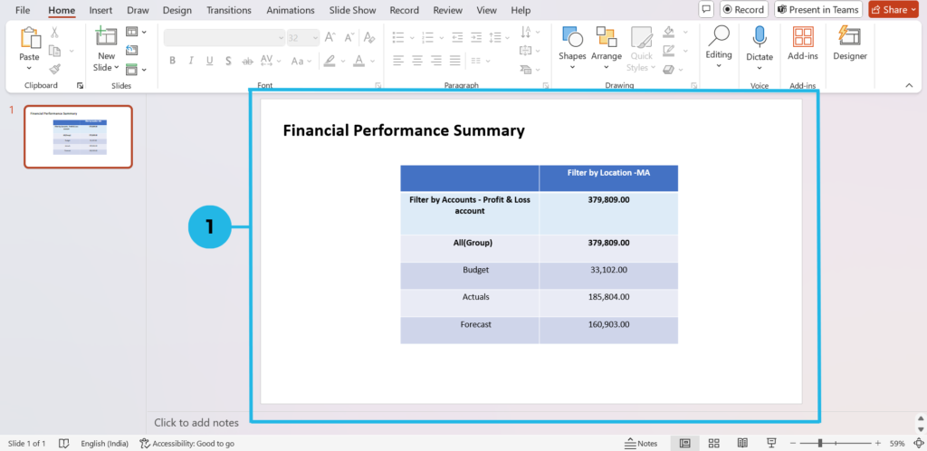
1.View Your Report – The PPT file opens, displaying slides populated with data from your PivotXL-generated report, formatted according to your selected template.