


Introduction
“A stacked column chart in Excel is a powerful way to visualize data by displaying different categories stacked on top of each other. As a result, it helps in comparing the contribution of each category to the total value. Moreover, this type of chart is commonly used in business reports, financial analysis, and survey data presentation. In this guide, we will walk you through the process of creating a stacked column in Excel with simple, step-by-step instructions. So, let’s get started!”
What is a Stacked Column Chart?
A stacked column chart is a type of bar chart where multiple data series are displayed in vertical columns, stacked on top of each other. Each column represents a total, while the segments show how individual components contribute to that total.
Why Use a Stacked Column Chart in Excel?
- Helps compare multiple categories within a dataset, making it easier to analyze differences.
- Clearly shows the contribution of each category to the whole, allowing for better insights.
- Moreover, it makes it easier to spot trends over time and understand data patterns.
- Additionally, it enhances data visualization for reports and presentations, improving clarity and effectiveness.
“Learn more about the Stacked Column chart in Excel and discover how it can help you visualize data trends more effectively.”
How to Create a Stacked Column Chart in Excel
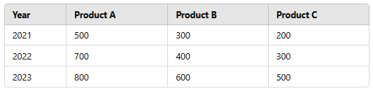
Prepare Your Data
Before creating the chart, organize your data in a tabular format. For example:
Insert the Stacked Column Chart
- Open Excel and select your dataset (including headers).
- Click on the Insert tab in the ribbon.
- In the Charts group, click on Insert Column or Bar Chart.
- Choose Stacked Column Chart from the options.
Customize Your Chart
Once the chart appears, you can customize it for better clarity:
- Add Chart Title: Click on the chart title to edit and provide a meaningful title.
- Label Data: Right-click on the columns and select Add Data Labels.
- Change Colors: Go to Chart Design > Change Colors to modify the color scheme.
- Adjust Axis Labels: Click on the horizontal or vertical axis to edit labels for better readability.
Format the Chart for Better Presentation
- Use Legend to differentiate categories (found under Chart Elements).
- Adjust Column Width to make bars more visible (Right-click bars > Format Data Series > Adjust Gap Width).
- Apply a background color or border to enhance visualization.
Alternative: 100% Stacked Column Chart
If you want to compare the relative percentage of each category rather than absolute values, you can use a 100% Stacked Column Chart.
- Follow the same steps as above.
- Instead of selecting Stacked Column Chart, choose 100% Stacked Column Chart.
- This will normalize the column heights, making it easier to compare proportions.
Conclusion
“Stacked column charts in Excel are a great way to visualize data trends and showcase category contributions in a structured and easy-to-understand format. Additionally, they allow you to compare multiple data series within a single chart, making it easier to identify patterns and trends over time. By following these simple steps, you can create and customize stacked column charts to enhance the clarity and effectiveness of your reports and presentations. Furthermore, with a few formatting adjustments, you can improve readability and make your data more visually appealing. So, why not try it out today and take your data visualization skills to the next level?”
“For more Excel tutorials, be sure to explore our latest guides on PivotXL and discover new ways to enhance your spreadsheet skills!”