


A Treemap Chart in Excel is a great way to visualize hierarchical data. It represents data using nested rectangles, where Excel displays each category as a larger box and places subcategories inside it. This type of chart is especially useful for comparing proportions and identifying patterns in large datasets. In this guide, we’ll walk you through how to create a Treemap Chart in Excel step by step. So, let’s get started!
What is a Treemap Chart in Excel?
A Treemap Chart in Excel helps display data in a structured format, making it easier to understand relationships between different categories. Instead of using traditional bar or pie charts, a treemap uses rectangles of different sizes and colors to represent values proportionally.
When to Use it in Excel?
- First, use it to visualize hierarchical data in a compact way.
- Additionally, it helps compare the relative size of categories and subcategories.
- Moreover, it is useful for analyzing market share, sales distribution, or budget allocations.
Learn more about Treemap Chart in Excel.
How to Create a Treemap Chart in Excel
Now that you know what a Treemap Chart is, let’s go through the steps to create one easily.
Step 1: Prepare Your Data
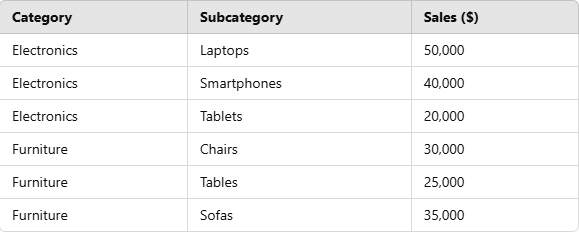
Before creating a Treemap Chart, you need to ensure your data is structured correctly. To begin with, the first column should contain the main categories, and then the second column should have subcategories, followed by their corresponding values.
Example Data:
Step 2: Insert a Treemap Chart
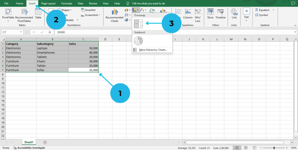
- Open Excel and select your data range.
- Go to the Insert tab in the Ribbon.
- Click on Hierarchy Chart and select Treemap Chart.
Step 3: Customize the Treemap Chart
Once your chart is inserted, you can customize it to improve readability:
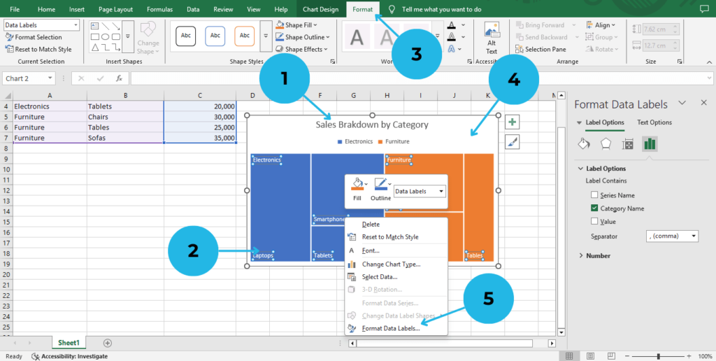
- Add a Chart Title: Click on the title and rename it (e.g., “Sales Breakdown by Category”).
- Change Colors: Click on the chart.
- Go to the Format tab, and select a new color scheme.
- Adjust Labels: Right-click on the chart.
- Select Format Data Labels, and choose how you want the labels to be displayed.
Step 4: Analyze Your Data
- Identify Larger Rectangles: These represent the highest values in your dataset.
- Compare Categories: See how different segments contribute to the total.
- Spot Trends: Identify which subcategories have the highest or lowest values.
Benefits of Using a Treemap Chart in Excel
- Efficient Data Representation: Displays a lot of information in a small space.
- Quick Comparisons: Makes it easy to compare different sections.
- Color-Coded Visualization: Helps in identifying patterns and trends at a glance.
Conclusion
Without a doubt, a Treemap Chart in Excel is an excellent tool for effectively displaying hierarchical data in a visually appealing way. By carefully following the steps outlined above, you can easily create a highly insightful and professional-looking chart within minutes. So, why not take the opportunity to try it today? Enhancing your data visualization skills will certainly help you present complex information more clearly and efficiently
For more Excel tips and tutorials, explore our latest guides on PivotXL!